Data Extinction: The Problem of Digital Obsolescence

Dinosaur PCB Graphic illustrating Digital ObsolescenceI suspect that many of us, as computer users, have had the experience of searching for some computer file that we know we saved somewhere, but can’t seem to find. Even more frustrating is the situation where, having spent time looking for the file and having found it, we discover either that the file has been corrupted, or is in a format that our software can no longer read. This is perhaps most likely to happen with digital photographs or videos, but it can also happen with text files, or even programs themselves. This is the problem of Digital Obsolescence.

In an earlier post, I mentioned a vector graphics file format called SVG, and I showed how you can use a text editor to open SVG files and view the individual drawing instructions in the file. I didn’t discuss the reason why it’s possible to do that with SVG files, but not with some other file types. For example, if you try to open an older Microsoft Word file (with a .doc extension) with a text editor, all you’ll see are what appear to be reams of apparently random characters. Some file types, such as SVG, are “text encoded”, whereas other types, such as Word .doc files, are “binary encoded”.

Within the computer industry, there has come to be an increasing acceptance of the desirability of using text-encoded file formats for many applications. The reason for this is the recognition of a serious problem, whereby data that has been stored in a particular binary format eventually becomes unreadable because software is no longer available to support that format. In some cases, the specification defining the data structure is no longer available, so the data can no longer be decoded.

The general problem is one of “data retention”, and it has several major aspects:

  • Storing data on physical media that will remain accessible and readable for as long as required,
  • Storing data in formats that will continue to be readable for as long as required.
  • Where files are encrypted or otherwise secured, ensuring that passwords and keys are kept in some separate but secure location where they can be retrieved when necessary.

Most people who have used computers for a few years are aware of the first problem, as storage methods have evolved from magnetic tapes to optical disks, and so on. However, fewer people consider the second and third problems, which is what I want to discuss in this article.

Digital Obsolescence: The Cost of Storage and XML

In the early days of computers, device storage capacities were very low, and the memory itself was expensive. Thus, it was important to make the most efficient use of all available memory. For that reason, binary-encoded files tended to be preferred over text-encoded files, because binary encoding was generally more efficient.

However, those days are over, and immense quantities of memory are available very cheaply. Thus, even if text-encoding is less efficient than binary-encoding, that’s no longer a relevant concern in most cases.

Many modern text-encoding formats (including SVG and XHTML) are based on XML (eXtensible Markup Language). XML provides a basic structure for the creation of “self-describing data”. Such data can have a very wide range of applications, so, to support particular purposes, most XML files use document models, called Document Type Definitions (DTDs) or schemas. Many XML schemas have now been published, including, for example, Microsoft’s WordML, which is the schema that defines the structure of the content of newer Word files (those with a .docx extension).

XML is a huge subject in its own right, and many books have been written about it, even without considering the large number of schemas that have been created for it. I’ll have more to say about aspects of XML in future posts.

Digital Obsolescence: Long Term vs. Short Term Retention

Let’s be clear that the kind of “data retention” I’m talking about here refers to cases where you want to keep your data for the long term, and ensure that your files will still be readable or viewable many years in the future. For example, you may have a large collection of digital family photos, which you’d like your children to be able to view when they have grown up. Similarly, you may have a diary that you’ve been keeping for a long time, and you’ll want to be able to read your diary entries many years from now.

This is a very different problem from short-term data retention, which is a problem commonly faced by businesses. Businesses need to store all kinds of customer and financial information (and are legally required to do so in many cases), but the data only needs to be accessible for a limited period, such as a few years. Much of it becomes outdated very quickly in any case, so very old data is effectively useless.

There are some organizations out there who will be happy to sell you a “solution” to long-term data retention that’s actually useful only for short-term needs, so it’s important to be aware of this distinction.

Digital Obsolescence: Examples from my Personal Experience

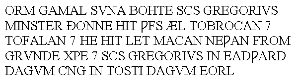
In the early “pre Windows” days of DOS computers, several manufacturers created graphical user interfaces that could be launched from DOS. One of these was the “Graphical Environment Manager” (GEM), created by Digital Research. I began using GEM myself, largely because my employer at the time was using it. One facet of GEM was the “GEM Draw” program, which was (by modern standards) a very crude vector drawing program. I produced many diagrams and saved them in files with the .GEM extension.

A few years later, I wanted to reuse one of those GEM drawing files, but I’d switched to Windows, and GEM was neither installed on my computer nor even available to buy. I soon discovered that there was simply no way to open a GEM drawing file, so the content of those files had become “extinct”.

Similarly, during the 1990s, before high-quality digital cameras became available, I took many photographs on 35mm film, but had the negatives copied to Kodak Photo-CDs. The Photo-CD standard provided excellent digital versions of the photos (by contemporary standards), with each image stored in a PCD file in 5 resolutions. Again, years later, when I tried to open a PCD file with a recent version of Corel Draw, I discovered that the PCD format was no longer supported. Fortunately, in this case, I was able to use an older version of Corel Draw to batch-convert every PCD file to another more modern format, so I was able to save all my pictures.

Digital Obsolescence: Obsolete Data vs. Obsolete Media

As mentioned above, the problem I’m describing here doesn’t relate to the obsolescence of the media that contain the files you want to preserve. For example, there can’t be many operational computers still around that have working drive units for 5.25” floppy disks (or even 3.5” floppy disks), but those small disks were never particularly reliable storage media in any case, so presumably anyone who wanted to preserve files would have moved their data to more modern and robust devices anyway.

I’ll discuss some aspects of media obsolescence further in a future post.

Digital Obsolescence: Survival Practices

So what can you do to ensure that your data won’t go extinct? There are several “best practices”, but unfortunately some of these involve some form of tradeoff, whereby you trade data survivability for sophisticated formatting features.

  • Never rely on “cloud” storage for the long term. Cloud storage is very convenient for short-term data retention, or to make data available from multiple locations, but it’s a terrible idea for long-term retention. All kinds of bad things could happen to your data over long periods of time: the company hosting the data could have its servers hacked, or it could go out of business, or else you could simply forget where you stored the data, or the passwords you need to access it!
  • Prefer open data formats to proprietary formats.
  • Prefer XML-based formats to binary formats.
  • Try to avoid saving data in encrypted or password-protected forms. If it must be stored securely, ensure that all passwords and encryption keys exist in written form, and that you’ll be able to access that information when you need it! (That is, ensure that the format of the key storage file won’t itself become extinct.)
  • Expect formats to become obsolete, requiring you to convert files to newer formats every few years.
  • Copy all the files to new media every few years, and try opening some of the copied files when you do this. This reduces the danger that the media will become unreadable, either because of corruption or because physical readers are no longer available.

Sometimes you’ll see recommendations for more drastic formatting restrictions, such as storing text files as plain-text only. Personally, I don’t recommend following such practices, unless the data content is extremely critical, and you can live within the restrictions. If you follow the rules above consistently, you should be relatively safe from “data extinction”.

A Trick of the Light: Exploiting the Limitations of Human Color Perception

Boulton Paul P.111A Aircraft at Baginton Airport

I snapped the image above many years ago during a visit to the Midlands Air Museum, near Coventry (England). It depicts the one-and-only Boulton-Paul P.111A research aircraft, which, due to its dangerous flight characteristics, was nicknamed the “Yellow Peril”.

I’ve posted this image now not to discuss the aerodynamics of the P.111A, but to consider its color. If you’re looking at the image on a computer monitor (including the screen of your phone, tablet or any similar digital device), you’re presumably seeing the plane’s color as bright yellow.

No Yellow Light Here

That, however, is an illusion, because no yellow light is entering your eyes from this image. What you are actually seeing is a mixture of red and green light, which, thanks to the limitations of the human visual system, fools your brain into thinking that you’re seeing yellow.

The Visible Spectrum

Most of us learn in school that what we see as visible light consists of a limited range of electromagnetic waves, having specific frequencies. Within the frequency range of visible light, most humans can distinguish a continuous spectrum of colors, as shown below.

(The wavelength range is in nanometers; nm)

Visible Spectrum of Light, with Wavelengths

We’re also taught that “white” light does not exist per se, but is instead a mixture of all the colors of light in the visible spectrum.

That’s a significant limitation of the human visual system; we can only see light whose frequency falls within a limited range. There are vast ranges of “colors” of light that aren’t visible to us. Presumably, our visual systems evolved to respond to the frequencies of light that were most useful to our ancestors in their own environment.

How do we see Color?

That leads to the question of how we can determine which light frequencies we’re seeing. Do our eyes contain some kind of detector cell that can measure the frequency of a ray of light? In fact, the system that evolution has bequeathed to us is a little more complex. Our eyes contain several different types of detector cell, each of which responds most strongly to light within a narrow frequency range.

There is one cell type called “rods” (because of their shape) that detect a relatively broad spectrum of light, but which are most sensitive to blue-green light. When the ambient light is low, the rods do most of the work for us, giving us monochrome vision.

There are also three types of cell called “cones”, the detection ranges of which overlap that of the rods. One type of cone is most sensitive to blue light, the second to green light, and the third to red. Given that blue light has the shortest visible wavelength, and red light the longest, the three types of cones are respectively called L (Long = Red), M (Medium = Green), and S (Short = Blue).

The diagram below shows the relative sensitivity of the rods (R) and cones (S, M, L) with respect to wavelength. I’ve also superimposed the color rainbow for convenience.

Sensitivity of Human Retina to visible light spectrum

It’s thanks to the existence of the cone cells that we have color vision. The brain actually combines the information from all the detector cells, and determines from that which color we’re actually looking at.

Fooling the Brain

The nature of our visual system makes it possible to fool our brains into thinking that we’re seeing colors that are not actually present, by combining red, green and blue light in varying intensities.

Technology takes advantage of this limitation to provide what seem to be full-color images (or videos) that use only three color channels: one each for red, green and blue (hence the RGB acronym). Such color systems are known as “Additive Color”.

Conversely, printed color images are created using a three-color (or four-color, if black is added) system that is “Subtractive”. Subtractive systems use Cyan, Magenta, Yellow and optionally Black as their “primary” colors, leading to acronym CMYK. A continuous spectrum of color is achieved by overlaying translucent layers of CMYK in varying proportions. Subtractive color systems are a complex topic in themselves, so I don’t plan to go into further detail about them in this article.

Here’s a comparison of the features of additive versus subtractive color.

Additive Color

In an additive color system, you add colored lights together to create the illusion of a continuous spectrum.

The human brain creates the illusion of a continuous spectrum of colors.

It’s important to realize that, in an additive system, the colors do not somehow combine in space to create a color that’s not there. Instead, our brains combine the responses of the three types of cone in our eyes.

Subtractive Color

In a subtractive color system, you start with white light (or paper), then subtract particular colors from white.

In a printed image, overlaid color dyes block some light wavelengths, so the remaining wavelengths that pass through create the final color.

This is not an “optical illusion” in the same way as additive color. With subtractive color, the yellow light you see really is yellow.

Viewing a Color Image

Television and computer screens use additive color. The screen you’re viewing is comprised of a large matrix of red, green and blue dots. By varying the intensity of light from each of the dots across the screen, your brain is tricked into thinking that it’s seeing a continuous spectrum of color from blue to red. The size of each dot is so small that your brain merges the light from neighboring dots together.

Are You Looking at a Print, a Slide or a Screen?

So, if you’re reading this article on a computer screen, the image of the Boulton Paul P.111A that you can see isn’t actually shining any yellow light into your eyes, but is using red and green light to fool your brain into thinking that you’re seeing yellow.

Having said all that, my image of the P.111A was originally a Kodachrome 25 color slide. Kodachrome slides create colors using a subtractive process, overlaying translucent layers of secondary colors. Thus, if you could view the original slide, you would indeed see yellow light, created by subtracting blue light from a white source shining through the slide.

If this all seems very complex at first, don’t be deterred, because I know from personal experience that it’s easy to become confused even when you’ve been working with these principles for a long time. When designing digital video equipment years ago, I sometimes found myself forgetting that, in nature, yellow light really is yellow, and is not a mixture of red and green light!

Comments on Commenting

This is just an administrative post, which you’ll need to read only if you plan to leave a comment on one of my posts. This is my policy on commenting, and a note about the images that appear on this blog.

gadget

Comments are welcomed and encouraged on this site, but all comments will be viewed and approved by the moderator before becoming visible.

There are also instances where comments will be edited or deleted as follows:

  • Comments deemed to be spam or possible spam will be deleted. Including a link to relevant content is permitted, but all comments should be clearly relevant to the post topic.
  • Comments including profanity will be deleted.
  • Comments containing language or concepts that could be deemed offensive will be deleted.
  • Comments that attack a person individually, or the display of which may expose me to potential liability for defamatory conduct of any kind, will be deleted.
  • This is a non-commercial blog, carrying no advertising, the goal of which is to disseminate information. Comments that promote specific goods or services are not permitted and will be deleted.
  • Given the declared subject matter of this blog, comments of a political or religious nature are unlikely to be relevant. Such comments will be deleted, unless they seem to be rational and highly relevant to the topic.
  • I have no interest in posting content written or supplied by others, whether paid or not, nor in entering into any collaborative effort in connection with the blog content. You can link to my posts, but you cannot re-post my content elsewhere. Please don’t bother to post comments or send emails asking about such arrangements.

The owner of this blog reserves the right to edit or delete any comments submitted to this blog without notice. This comment policy is subject to change at anytime.

Images: all images shown on my blog are copyright (whether or not they contain an explicit copyright statement), and may not be reproduced anywhere else, in any form, without my written permission in advance.

Oh, and one final thought. If you send me a vague comment claiming that I need to check spelling in my posts, then I’ll know you haven’t read them!

Analyzing CSS Styles in a Large Set of XML Documents

This post explains how I created a small program for the automated processing of text, so there won’t be anything about graphics or spelling here! I’ve created many such programs, large and small, over the years, so this is just intended as a sample of what’s possible. This program analyzes CSS styles applied to a large set of XML-based documents.

In my work, I frequently need to be able to analyze and modify large sets of XML-encoded documents (typically 10,000+ documents in a single project). It’s simply not practical to do this by opening and editing each document individually; the only realistic way is to write a script or program to perform the analysis and editing automatically.

Recently, I needed to update a Cascading Style Sheet (CSS file) that was linked to a large number of XHTML topic documents in a publishing project. The CSS file had been edited by several people over many years, with little overall strategy except to “keep it going”, so I was aware that it probably contained many “junk” style definitions. I wanted to be able to delete all the junk definitions from the CSS file, but how could I determine which styles were needed and which were not? I needed a way to scan through all 10,000+ files to find out exactly which CSS classes were used at least once in the set.

Years ago, I gained a great deal of experience of programming in C++, using Microsoft’s MFC framework. About 8 years ago, for compatibility with other work that was being done by colleagues, I began to transition to programming in C# using Microsoft’s .NET architecture. Thus, I decided to use C#/.NET to create a program that would allow me to scan huge numbers of XHTML files rapidly and create a list of the CSS styles actually found in the topic files.

Until the advent of .NET 3.5, I’d become accustomed to working with the class XmlDocument. While this was a definite improvement over previous “XML” handling classes, it could still be awkward for certain operations, such as, for example, constructing and inserting new XML snippets in an existing document. I was delighted, then, to discover the new XDocument class that was introduced with .NET 3.5, and I now use the newer class almost exclusively. (For some discussion of the differences, see http://stackoverflow.com/questions/1542073/xdocument-or-xmldocument)

Analyzing CSS Styles: Code Sample

Here are the critical methods of the class that I created to walk the XML tree in each document. The first method below, walkXMLTree(), executes the tree walking operation. To do that, it obtains the root element of the XML tree, then calls the second method, checkChildElemsRecursive(), which actually traverses the tree in each document.

using System.IO;
using System.Xml.Linq;

public int walkXMLTree(string strRootFolderpath, ref SortedList<string, string> setClasses)
{
    string[] strFilepaths = Directory.GetFiles(strRootFolderpath, "*.htm", SearchOption.AllDirectories);

    List<string> listDocsFailedToLoad = new List<string>();

    int iElemsChecked = 0;

    foreach (string strFilepath in strFilepaths)
    {
        try
        {
            _xdoc = XDocument.Load(strFilepath);
            _xelemDocRoot = _xdoc.Root;
            iElemsChecked += checkChildElemsRecursive(_xelemDocRoot, ref setClasses, strFilepath);
        }
        catch
        {
            listDocsFailedToLoad.Add(strFilepath);
        }
   }

   return iElemsChecked;
}

private int checkChildElemsRecursive(XElement xelemParent, ref SortedList<string, string> setClasses, string strFilename)
{
    int iElemsChecked = 0;
    string strClass;
    XAttribute xattClass;

    IEnumerable<XElement> de = xelemParent.Elements();

    foreach (XElement el in de)
    {
        // Find class attribute if any
        xattClass = el.Attribute("class");
        if (xattClass != null)
        {
            strClass = el.Name + "." + xattClass.Value;
            if (!setClasses.ContainsKey(strClass))
                setClasses.Add(strClass, strFilename);
        }
        iElemsChecked++;

        iElemsChecked += checkChildElemsRecursive(el, ref setClasses, strFilename);
    } 

    return iElemsChecked;
}

[Code correction 6/20/16: I changed xelemParent.Descendants() to xelemParent.Elements(). By using Descendants, I was doing the work twice, because Descendants returns child elements at all sub-levels, instead of just the first level. The code works correctly either way, but if you use Descendants, the recursion is unnecessary.]

The use of the System.IO and System.Xml.Linq libraries is declared at the top of the code.

The basic method is walkXMLTree(), which generates a sorted list setClasses of CSS classes used in every one of the XHTML files under the root folder strRootFolderpath. In this implementation, the returned list contains the CSS class name in the first element of each item (for example, “span.link”), and, in the second element, the file path of the first topic file that was found to contain that class.

The method walkXMLTree() contains a loop that examines every strFilepath in the array strFilepaths. Although every topic file under strRootFolderpath is expected to contain valid XML, it’s always possible that a file contains invalid XML markup. In that case, the XDocument.Load() method throws an exception, which stops program execution. To avoid crashing the program in such a case, I wrapped XDocument.Load() in a try-catch loop. If the method fails for a particular file, the code adds the path and name of that file to listDocsFailedToLoad, then moves on to the next file. When all the files have been scanned, I can then examine listDocsFailedToLoad to see how many files couldn’t be opened (hopefully not a large number, and usually it isn’t).

For each XHTML topic that it succeeds in opening, walkXMLTree() calls the method checkChildElemsRecursive() to traverse the element tree in that document. Note that the checkChildElemsRecursive() method is indeed recursive, since it calls itself in its own foreach loop. When checkChildElemsRecursive() is initially called from walkXMLTree(), the xelemParent parameter that is passed in is the root element of the XML tree in the document being scanned.

When control finally returns from checkChildElemsRecursive() to walkXMLTree(), the variable iElemsChecked contains the complete number of XML elements that were examined. This is likely to be a huge number; in one recent test, more than 8 million elements were processed.

The final content of setClasses will be a list of every class that’s used in at least one of the topic files. In the example above, I also set each item to show the filepath of the first file that was found that included that class, because I wasn’t expecting too many surprises! To obtain a complete analysis, you could, of course, make the second item in the SortedList a sublist that would include the file path of every topic using that class.

The Two Types of Computer Graphics: Bitmaps and Vector Drawings

I received some feedback from my previous posts on computer graphics asking for a basic explanation of the differences between the two main ways of representing images in digital computer files, which are:

  • Bitmap “paintings”
  • Vector “drawings”

Most people probably view images on their computers (or phones, tablets or any other digital device with a pictorial interface) without giving any thought to how the image is stored and displayed in the computer. That’s fine if you’re just a user of images, but for those of us who want to create or manipulate computer graphic images, it’s important to understand the internal format of the files.

Bitmap Images

If you’ve ever taken or downloaded a digital photo, you’re already familiar with bitmap images, even if you weren’t aware that that’s what digital photos are.

A bitmap represents an image by treating the image area as a rectangle, and dividing up the rectangle into a two-dimensional array of tiny pixels. For example, an image produced by a high-resolution phone camera may have dimensions of 4128 pixels horizontally and 3096 pixels vertically, requiring 4128×3096 = 12,780,288 pixels for the entire image. (Bitmap images usually involve large numbers of pixels, but computers are really good at handling large numbers of items!) Each pixel specifies a single color value for the image at that point. The resulting image is displayed simply by copying (“blitting”) the array of pixels to the screen, with each pixel showing its defined color.

Some of the smallest bitmap images you’ll see are the icons used for programs and other items in computer user interfaces. The size of these bitmaps can be as small as 16×16 pixels, which provides very little detail, but is sufficient for images that will always be viewed in tiny sizes. Here’s one that I created for a user interface some time ago:

icon16x16_versions2

Enlarging this image enables you to see each individual pixel:

icon16x16_versions_enlarged

You can see the pixel boundaries here, and count them to confirm that (including the white pixels at the edges) the image is indeed 16×16 pixels.

Obviously, the enlarged image looks unacceptably crude, but, since the image would normally never be viewed at this level of magnification, it’s good enough for use as an icon. In most cases, such as digital photographs, there are so many pixels in the bitmap that your eye can’t distinguish them at normal viewing sizes, so you see the image as a continuous set of tones.

Bitmap images have a “resolution”, which limits the size to which you can magnify the image without visible degradation. Images with higher numbers of pixels have higher resolution.

Given that bitmap image files are usually large, it’s helpful to be able to be able to compress the pixel map in some way, and there are many well-known methods for doing this. The tradeoff is that, the more compression you apply, the worse the image tends to look. One of the best-known is JPEG (a standard created by the Joint Photographic Experts’ Group), which is intended to allow you to apply variable amounts of compression to digital photographs. However, it’s important to realize that bitmap image files are not necessarily compressed.

Programs that are designed to process bitmap images are referred to as “paint” programs. Well-known examples are: Adobe Photoshop and Corel PhotoPaint.

Vector Images

The alternative way of producing a computer image is to create a list of instructions describing how to draw the image, then store that list as the image file. When the file is opened, the computer interprets each instruction and redraws the complete image, usually as a bitmap for display purposes. This process is called rasterization.

This may seem to be an unnecessarily complex way to create a computer image. Wouldn’t it just be simpler to stick to bitmap images for everything? Well, it probably wouldn’t be a good idea to try to store a photo of your dog as a vector image, but it turns out that there are some cases where vector images are preferable to bitmap images. Part of the skill set of a digital artist is knowing which cases are best suited to vector images, and which to bitmaps.

There are many vector drawing standards, and many of those are proprietary (e.g., AI, CDR). One open vector drawing standard that’s becoming increasingly popular is SVG (Scalable Vector Graphics). You can view the contents of an SVG file by opening it with a text editor program (such as Notepad).

Here’s a very simple example of an SVG image file, consisting of a white cross on a red circle:

icon_err_gen

(Not all browsers can interpret SVG files, so I rendered the image above as a bitmap to ensure that you can see it!)

If you open the SVG file with a text editor, you can see the instructions that create the image shown above. In this case, the important instructions look like this:

<g id=”Layer_x0020_1″>

<circle class=”fil0″ cx=”2448″ cy=”6098″ r=”83″/>

<path class=”fil1″ d=”M2398 6053l5 -5c4,-4 13,-1 20,5l26 26 26 -26c7,-7 16,-9 20,-5l5 5c4,4 1,13 -5,20l-26 26 26 26c7,7 9,16 5,20l-5 5c-4,4 -13,1 -20,-5l-26 -26 -26 26c-7,7 -16,9 -20,5l-5 -5c-4,-4 -1,-13 5,-20l26 -26 -26 -26c-7,-7 -9,-16 -5,-20z”/>

</g>

As you’d expect, the instructions tell the computer to draw a “circle”, and then create the cross item by following the coordinates specified for the “path” item.

Of course, if you were to try to represent a photograph of your dog as a vector image, the resulting file would contain a huge number of instructions. That’s why bitmap images are usually preferable for digital photographs and other very complex scenes.

A major advantage of vector image formats is that the picture can be rendered at any size without degradation. Bitmap images have inherent resolutions, which vector images do not have.

Programs that are designed to process vector images are referred to as “drawing” programs. Well-known examples are: Adobe Illustrator and Corel Draw.

Converting Between Bitmap and Vector Images

It’s often necessary to convert a vector image into a bitmap image, and, less frequently, to convert a bitmap image into a vector image.

Conversion of vector images to bitmaps occurs all the time, every time you want to view the content of a vector image. When you open a vector image, the computer reads the instructions in the file, and draws the shapes into a temporary bitmap that it displays for you.

Converting bitmaps to vector images requires special software. The process is usually called “Tracing”. Years ago, you had to buy tracing software separately, but now most vector drawing software includes built-in tracing capabilities. As the name suggests, tracing software works by “drawing around” the edges of the bitmap, so that it creates shapes and lines representing the image. The result of the operation is that the software generates a set of mathematical curves that define the vector image.

Summary of the Pros and Cons

There are situations where bitmap images are preferable to vector images, and vice versa. Here’s a summary of the pros and cons of each type.

Bitmap

Advantages:

  • Complex scenes can be depicted as easily as simple scenes.
  • Significant compression is usually possible, at the expense of loss of quality.
  • Rendering is computationally easy; requires minimal computing power.

Disadvantages:

  • Size: Files tend to be large.
  • Not scalable: attempting to magnify an image causes degradation.

Vector

Advantages:

  • Compact: Files tend to be small.
  • Scalable: images can be displayed at any resolution without degradation.

Disadvantages:

  • Complex scenes are difficult to encode, which tends to create very large files.
  • Rendering is computationally intensive; requires significant computing power.

Artwork Postscript: Pre-Computer Techniques

I mentioned in a previous post that, in “pre-computer” days, I’d frequently create ink artwork by drawing an initial pencil sketch, then inking it in and erasing the pencil outline as I went. This early example was produced in that way, except that, for some long-forgotten reason, in this case I still have a version of the original sketch.

pysch_gambling2

At the time, I was the Publicity Officer of the Imperial College H G Wells Society, and this was a poster illustration for a talk entitled “The Psychology of Gambling”. The reason for choosing a “comic strip” inkwork technique was due to the limitations of the society’s poster printing capabilities. Posters could be printed only in black, and the process handled line art much better than it did halftones.

The lettering for the poster, which isn’t included in the image, was added by literally pasting down strips of printout from the same phototypesetter that was used to create the Student Union newspaper. This was long before the days of desktop publishing!

The pencil sketch that survives in this case shows some differences, relative to the final form of the drawing. The pose of the male figure is actually better in the sketch; he seems to have become more stiffly “wooden” in the final image!

pysch_gambling_sketch

The pencil sketch also reveals the design of the image, in that the vanishing point was deliberately set to be the palm of the male figure’s hand.

This was the first illustration I created while at Imperial College, and its public display led to many other requests for artwork during my undergraduate days.

Moggies: Computer Techniques for Comic Strips

Here is another example of how I’ve used computer techniques to help with the production of artwork that not only appears to be “conventional” (i.e., drawn or painted directly on paper), but is in fact largely produced using conventional methods.

Several years ago, I produced a short series of comic strip cartoons titled “Moggies” (“moggie” being a British slang term for a non-pedigree cat). I wanted to produce the strips using the standard “brush and ink” technique, but I didn’t want to spend a lot of time trying to ink in the balloon text, and felt that that task would be more efficiently handled using computer desktop publishing techniques.

Of course, it is possible to create comic strips entirely using computer techniques, and I’m not suggesting that conventional techniques are somehow better. Nonetheless, in this instance I wanted the published strip to look informal and light-hearted, and I felt that a more “freehand” approach would help to provide those qualities.

The Final Result

Let’s look at one of the final cartoons, before discussing how it was produced. This was exhibited in an Art Show, where it won a “Best of Show” prize. As you can see, the style looks like a fairly standard comic strip; consisting of colored-in areas over a black outline. There’s nothing remotely avant garde about the design of the strip; it has four rectangular panels, the aim being to make it easy to follow. This was a humorous cartoon, so I wanted the artistic style to be “casual” and light, rather than precise and technically accurate.

The Complete 4-panel Moggies Cartoon

Since I’d be “telling a story” here, the first step of course was to specify the details of the story, and decide how it would be plotted. I’d decided that my strip would have four panels, and I’d use the panels to develop a “gag”. The punch line for the gag would obviously need to be in the fourth panel, with the scenes in the previous three panels providing the lead-up to that.

Comic strips usually adhere to implicit conventions that you need to follow, if you want your readers to be able to follow the strip easily. For example, in English-language countries, we read the strip from top to bottom, and from left to right. It’s important that the conversation “bubbles” in the strip frames should also flow from left to right, so that readers will tend to read each one in the order that is natural for them. Thus, the positions of the cats in each frame of the strip had to be such that it would be possible to place the bubbles in the most readable order.

Firstly then, I wrote out the script for the bubbles in the four frames, without pictures, to ensure that the gag would be understandable. This also established how many bubbles there would need to be.

Next, I printed the outlines of the four frames on a sheet of paper (just so I’d be able to erase portions of the drawing without having to redraw the frames). Within the frame outlines, I sketched in the cats in pencil, together with rough ellipses for the positions of the bubbles, as below.

The 4-panel Pencil Sketch for the Moggies Cartoon

I then scanned my pencil drawing, and imported the scanned bitmap into Corel Draw. I added the bubbles as vector ellipses in Corel Draw (and then trimmed the ellipses with the frame borders, as I described for the gear icon in a previous post). I inserted the text into the bubbles, using an appropriately-named font called “Balloon”, and adjusted everything so that the text fitted neatly into the bubbles. In the working image below, the red and green outlines show the elements that were generated by Corel Draw, over the top of the scanned pencil bitmap.

Speech Bubbles and Outlines added to 4-panel Moggies Cartoon

When I’d arranged everything as I wanted, I inked in the original pencil sketch of the cats, as below. Then, I rescanned the inked drawing as below, and imported that into the same Corel Draw file, replacing the previous scanned pencil image.

Inked-in Pencil Drawing for 4-panel Moggies Cartoon

At this point, you may be wondering, “But what about the colors?” Having combined the inked drawing with the computer-generated outlines and text in Corel Draw, I printed out the result on a laser printer. This provided a complete, waterproof outline drawing with text, over which I could paint using watercolors. Of course, I could have colored in the monochrome outline in the Corel Draw image, but I felt that hand-coloring would convey the “casual” style that I wanted.

This post more or less completes my series on computer-assisted artwork production. I do plan to add one more short “postscript” post, describing an very early item of comic strip artwork that I produced in my “pre-computer” days!

Using Computer Techniques to Produce “Conventional” Artwork Efficiently

In the previous post, I described techniques for producing artwork that is intended for use with computers, and intentionally looks like it is computer-produced. In this post, I want to discuss how computer techniques can help you produce more “conventional” artwork more accurately and efficiently.

A few years ago, I set about producing a painting that would show a fictitious ruined Roman temple in Britain, as it might have appeared a century or so after the Roman legions left Britannia. I wanted to show the building glowing in the winter sun, after a snowfall. This idea was inspired by the many medieval monastic ruins that actually exist in North Yorkshire, where I grew up. Many of these buildings were constructed from local sandstone, the honey color of which seems to glow in low sunlight.

The Final Painting

My deliberate goal was to create a conventional painting using watercolor, gouache and colored pencil. I felt that this combination of media would best achieve the lighting effects that I wanted. Here’s the final result, so you can see what I was aiming to achieve.

temple2

The painting was created on paper, on a watercolor block, which is a pad consisting of sheets of paper that are glued on all four sides. The idea of that is to prevent the paper wrinkling when you apply the wet paint to it.

My usual starting point when tackling such work is to draw a light outline in pencil on the blank paper, then adjust the outline as necessary to achieve the composition that I want. When satisfied with the composition, I begin applying paint, erasing the outline as I go so that it doesn’t show through the transparent watercolor.

At this point, you may think that I’m going to tell you that I used a CAD program to design a 3-D model of the building, then created a view of that for the painting. While that would be possible, I didn’t need to spend time doing that in this case, because I understand perspective drawing, and I had a fairly clear idea of what I wanted the building to look like. Instead, it was much quicker for me to establish a couple of vanishing points, then draw perspective lines to delineate the building.

Posing the Cat

One of the elements that I wanted to include in the painting was a “wildcat”, which, in order to be visible, would need to be placed somewhere in the foreground. However, I wasn’t sure what would be the best pose for the cat, or exactly where to place it.

Although we had a large tabby cat who would make a good model for a “wildcat”, he was naturally reluctant to pose in any desired position! I wanted to be able to play around with the size and position of the cat in the final painting. In my “pre-computer” days, I’d have done this manually, by drawing and erasing the cat sketch several times, but it’s much faster to draw an initial sketch, then scan the entire outline and cut out (electronically) the portion with the cat (as below). You can then move that portion around to decide the best position and pose. The computer-assisted method is much faster, and enables you to make more exhaustive experiments before settling on the final design.

wildcatSketch1

A further technique that is much easier with computer assistance is to see your image “with different eyes”. When working on an image for many hours, I sometimes find that I become so familiar with it that I fail to see obvious errors until it’s too late. I can avoid this over-familiarity by scanning the picture, then modifying the scanned image in various ways. In this case, I posterized the scanned image to create a “stipple effect” monochrome version, then flipped the result horizontally, as below.

temple2r1

This allowed me to look at the whole picture afresh, and see whether anything was obviously wrong.

The Lions of Aker (aka the Lions of Yesterday & Tomorrow)

One feature of the painting that immediately strikes most viewers is the unusual segmental shape of the temple’s pediment, contrasting with the usual triangular shape of a classical pediment. The segmental shape was inspired by a real image of an Isean temple on a genuine Roman coin, although I’m aware that the image may not be an accurate depiction of a real building!

I also wanted the pediment to feature a carving showing the “Lions of Aker”, which is an Ancient Egyptian motif. I didn’t want to copy any existing drawing of the lions slavishly, but instead create my own version of the design, as below.

temple_parapet

I wanted the lions to be exact back-to-back reflections of each other. I had a general idea of what I wanted my “heraldic beasts” to look like, so I sketched out one lion freehand, as below, together with part of the central shield that it would be supporting. When I was happy with the shape, I inked in the outline with a thin black pen, so that the image would scan well. The outline isn’t perfect, but it doesn’t need to be.

lionhorizon2

After scanning the image of the one lion and cleaning up the result, it was a simple matter to create a flipped copy of it for the other lion, and then use a vector drawing program (Corel Draw) to insert the central shield as an ellipse. The result was as shown below.

2lionsCrest

Of course, in the painting, we’re not looking at the temple pediment head-on, so the effects of perspective must be taken into account. Therefore, I used Corel Draw’s distortion tools to skew the drawing, approximating the perspective angles that allow it to fit into the picture, as below. It was then simply a case of transferring the final image of the fictitious carving to the watercolor pad, painting it in and adding the shading and fallen snow.

parapet_projection

In the next post in this series, I’m going to discuss how to use computer graphic techniques to help with the production of a humorous comic strip.

Adapting Drawing Principles for Computer-Generated Artwork

I learned to draw in two “old fashioned” ways. One way was “freehand” with pencil and paper; you just sat down with a blank sheet of paper, and sketched everything out as best your drawing skills would allow. It wasn’t especially precise, but that was acceptable in the context.

The second way was what was called “Geometric” drawing. You still needed a pencil and a piece of paper, but also a drawing board and a tee square, and probably also a pair of compasses, protractor, dividers, etc. If you needed to create a neat, precise drawing, this was the way to achieve it.

My grandfather had been a professional draughtsman [British English spelling, and, yes, it is pronounced “draftsman”!] for the City of Leeds, and that was the way he produced drawings too. I still have a few of his drawing tools, including a pair of brass compasses that pivot around a soldered-on gramophone needle!

Another useful tool for geometric drawing was a set of stencils. These were wooden or plastic templates, offering regular shapes that you could draw around or inside. For example, even the best artists have difficulty drawing an exact circle freehand, so circle templates were useful when these were needed.

These days, of course, I suspect that almost nobody still does geometric drawing with a board and tee square, just because it’s easier to produce the same results, or better, using computers.

When I made the switch from pencil-and-paper drawing to computer artwork generation, I was initially confused about how to translate the techniques I’d learned. Was there a computer equivalent of a pair of compasses, a protractor, and so on? Although there are in fact such equivalents, they’re not necessarily the best way to go about producing a drawing. It took me much time and practice before I learned the best ways to translate conventional geometric drawing techniques into their digital equivalents.

Although I did considerable online research, and bought books on the subject, I was never able to find a tutorial providing a general approach to this kind of drawing problem. Everything I found was either very abstract, or else was a specific set of instructions to enable you to draw “exactly what I already drew”. I didn’t find any of that particularly useful, so I’m offering this post in the hope that it may, in a small way, fill that void for aspiring computer artists.

Creating a Gear Icon

Recently, I needed to produce a “gear icon” drawing for some computer documentation. This type of icon is quite popular these days for the identification of “Settings” controls in software, in a linguistically neutral way. The end result I had in mind was to be as shown below.

gear_synth_final

The tool I’d be using was Corel Draw (similar to Adobe Illustrator), which produces vector drawings. The advantage of vector drawing over bitmap painting (as would be produced by Adobe Photoshop) is that you can draw your original at any scale, and re-scale your final image to any size without loss of resolution. (A vector drawing records shapes as sets of mathematical equations, rather than color values in a matrix of pixels.)

So, how to go about producing this icon? One fact about computer artwork that I learned early on was that there are many ways to produce the same output, so it becomes a question of choosing the most efficient way to produce the result that you want.

It also pays to make maximum use of your software’s built-in drawing “primitives” whenever you can. Any credible vector drawing package includes controls for drawing such basic shapes as rectangles, circles, etc., and most include controls to produce more sophisticated shapes.

To produce the gear icon, I could have drawn out every curve individually, then tried to tweak the result until it was correct, but this would be incredibly slow, and likely produce an imperfect result. Alternatively, I could have started with a circle, then created a “tooth” shape, and attached rotated copies of the tooth to the circle, but this again seemed like a lot of work!

An Efficient Method

Of the available primitive shape controls, the Star tool seemed to produce a result that had the greatest resemblance to my desired result (Adobe Illustrator offers a very similar Star tool). So, I selected the Star tool and drew a regular, 11-point star, as below. The exact proportions of the star didn’t matter in this case, so I just “eyeballed” them. (The fill color used in these samples is for clarity only; you can use any fill type, or none at all.)

gear_synth1

Now I had to trim and modify the basic star shape to make it look more like a gear.

Next, I used the Ellipse tool to draw 3 concentric circles over the star, and centered all the objects vertically and horizontally, as below. The exact diameters of the circles didn’t matter. All that mattered was that the diameter of the outermost circle should be less than that of the star, and the diameters of the other two circles should be respectively larger and smaller than the inner portion of the star, as shown.

gear_synth2

Now, I opened Corel Draw’s Shaping menu to begin combining the basic shapes. Firstly, I selected the outermost circle and used the Intersect control in the Shaping menu to lop off the points of the star, with the result below.

gear_synth3

Next, I selected the outermost remaining circle (above), and used the Weld control in the Shaping menu to merge it with the remains of the star. This “filled in” the inner vertices of the star, to create the gear’s “bottom land”, as below.

gear_synth4

Finally, it was just a question of using the innermost (remaining) circle to punch out the hole in the center. I achieved this by selecting the inner circle, then using the Trim tool in the Shaping menu to remove the center from the remains of the star shape.

Final Drawing

The end result was exactly the shape that I wanted. I’m now able to recolor and resize this vector shape for whatever application I need. Below is an example of the icon applied to a fictitious software button.

gear_synth_example

Just to demonstrate that the hole in the center of the gear icon really is a hole and not an opaque circle, below is an example of the gear icon laid over a bluish square in Corel Draw. The square is covered by the red portion of the icon, but shows through the hole in its center.

gear_synth_overlap

I suppose that there’s an element of “lateral thinking” in these designs, in the sense that you have to start by thinking about the desired end result, then work backwards from there to the primitive shapes supplied by the drawing tool.

In my next post, I plan to discuss how to use computer-aided techniques to assist the production of more “conventional” artwork.

The Spelling of English: Carved in Stone?

Why does the spelling of English seem so illogical? Surely, every one of us who has learned to write the language must have asked ourselves (or someone else) that question at some point. There are many other languages where the very idea of writing words in a way that doesn’t represent their sounds would seem utterly pointless, so why is this considered not merely acceptable, but correct, in English?

Part of the answer is that early writers took to writing the language using an alphabet that didn’t contain symbols for several sounds that already existed in spoken English. The details of this process are complex, and are excellently covered in The History of English Spelling (Christopher Upward).

As a teenager, I stumbled across an astonishing example of early English writing that not only illustrates a now-extinct solution to the problem of English spelling, but also documents some momentous times in England’s history.

The Hidden Sundial
In a secluded rural valley near the town where I was born, in Northern England, there’s a plain and unassuming little church, called St. Gregory’s Minster. The image below, from my most recent visit, shows the building from the South.

View of St. Gregory's Minster, Ryedale
St. Gregory’s Minster, Ryedale, from the South

By an accident of history, an inscription that had been carved into the church’s wall when it was built has been preserved to this day. Based on its content, it’s possible to date the inscription quite accurately.

The inscription is on a lintel above the doorway in the church’s south wall, and it originally formed the surrounding of a sundial above the door. A porch was built onto the doorway at some later date, and plaster was applied to the walls inside the porch. The inscription was thus covered up until 1771, when it was rediscovered, in remarkably good condition. The image below, of the complete inscription, is enhanced to make the characters easier to read.

St. Gregory's Minster, Inscription on Sundial
The Complete Inscription

Deciphering the Message
The text is, to our eyes, very difficult to decipher, partly because there are no spaces between words. With spaces restored, and with the character forms converted to more modern equivalents, the main text actually reads like this.

Inscription Main Text in Modern Characters
The Main Text, using Modern Characters

This is indeed a form of English, but there was no “Standard English” at the time of its writing. Since the departure of the Romans, what is now England had been divided into separate kingdoms, each of which spoke their own dialect. At that time, the various kingdoms had only recently become federated, under the leadership of Alfred the Great. The inscription is written in the Northumbrian dialect of Old English, and uses abbreviations and letters that are absent from the modern language. Translated into modern English, the main text says;

Orm Gamalson bought St. Gregory’s Minster when it was all broken and fallen down, and he had it made anew to Christ and St. Gregory, in the days of King Edward and in the days of Earl Tostig

The names of King Edward, and Earl Tostig provide the clues as to the date of the inscription. Earl Tostig ruled Northumbria between 1055 and 1065, and King Edward (Edward the Confessor) ruled England as a whole from 1042 to 1066. Hence the inscription can be dated to between 1055-65.

Spelling of English: Northumbrian Spelling Conventions
Most people are aware that the character set that we now use to write English was derived from the Roman alphabet, but may not realize that our language was not originally written in that alphabet.

The earliest English language was written using an alphabet called “runes”. The Roman alphabet was introduced into Britain between about 40 and 400 CE, during the Roman occupation of the territory. The Romans left behind Christian churches with a tradition of speaking Latin, and writing using the Roman alphabet. Around 700 CE, church historians opted to start writing the English language using Roman letters, instead of runes.

When English was written using runes, there was one letter for each sound, and the spelling of English was always phonetic and logical. Unfortunately, however, not all the sounds of the English language could be represented by the Roman letters. For example, the Roman alphabet offered no way to represent the English “th” sound, or the English “w” sound.

Two different solutions to these problems arose. One solution, which is now extinct, probably originated at Lindisfarne, in Northumbria. The inscription at St. Gregory’s Minster is written using this Northumbrian method, which involved the retention of the runic symbols for the English sounds that the Roman alphabet could not represent. For example, the rune thorn, which looks like a “p” with a small projection, was used for the “th” sound, and the rune wynn (which, unfortunately, also looks like a “p”) was used for the “w” sound. It isn’t difficult to guess why this system might have fallen from favor — the shapes of thorn, wynn and ‘p’ are all confusingly similar to each other. As a partial solution to this problem, the letter thorn was frequently replaced by a symbol consisting of a ‘d’ with a cross through it, called edh (as is still used in modern Icelandic).

Spelling of English: Wessex Spelling Conventions
The alternate method of representing these sounds came from Wessex, in what’s now Southern England. The Wessex method substituted two-letter combinations, such as “t.h.” for the “th” sound, and “u.u.” for the “w” sound. As we all know, it was the Wessex method that eventually prevailed.

Soon after the inscription was written, in 1066, the king mentioned in the inscription, Edward the Confessor, died, and battles erupted between the claimants to the English throne. Seeking revenge, Tostig teamed up with the Norwegian king, Harald Hardrada, and together they invaded England from the North. Their invasion was repulsed and defeated by a resident claimant, Harold Godwinson (who happened to be Tostig’s brother), but a third claimant, William of Normandy, took advantage of Harold’s absence in the North, by mounting his own invasion from France. As is now well-known, William defeated Harold at the Battle of Hastings, and the Norman victory simply terminated the line of the Old English monarchy.

Spelling of English: English Goes Underground
In order to consolidate his power, William dispossessed all the English earls, and changed the official language of his kingdom to an old version of French. As a result, the English language went “underground” for a couple of centuries. For several hundred years, English existed as an unofficial vernacular language, which meant that many of its speakers were illiterate. This created a situation where sound changes in the spoken tongue were not reflected in the written language, which contributed further to the dephoneticization of English spelling that had commenced with the changeover from the runic alphabet.

When it finally re-emerged, English had been forever changed by its contact with French, having metamorphosed into a language much more recognizable to us.