Moggies: Computer Techniques for Comic Strips

Here is another example of how I’ve used computer techniques to help with the production of artwork that not only appears to be “conventional” (i.e., drawn or painted directly on paper), but is in fact largely produced using conventional methods.

Several years ago, I produced a short series of comic strip cartoons titled “Moggies” (“moggie” being a British slang term for a non-pedigree cat). I wanted to produce the strips using the standard “brush and ink” technique, but I didn’t want to spend a lot of time trying to ink in the balloon text, and felt that that task would be more efficiently handled using computer desktop publishing techniques.

Of course, it is possible to create comic strips entirely using computer techniques, and I’m not suggesting that conventional techniques are somehow better. Nonetheless, in this instance I wanted the published strip to look informal and light-hearted, and I felt that a more “freehand” approach would help to provide those qualities.

The Final Result

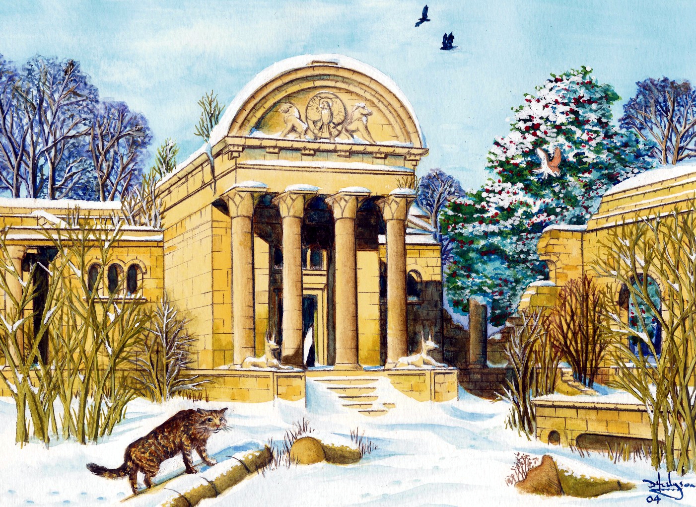
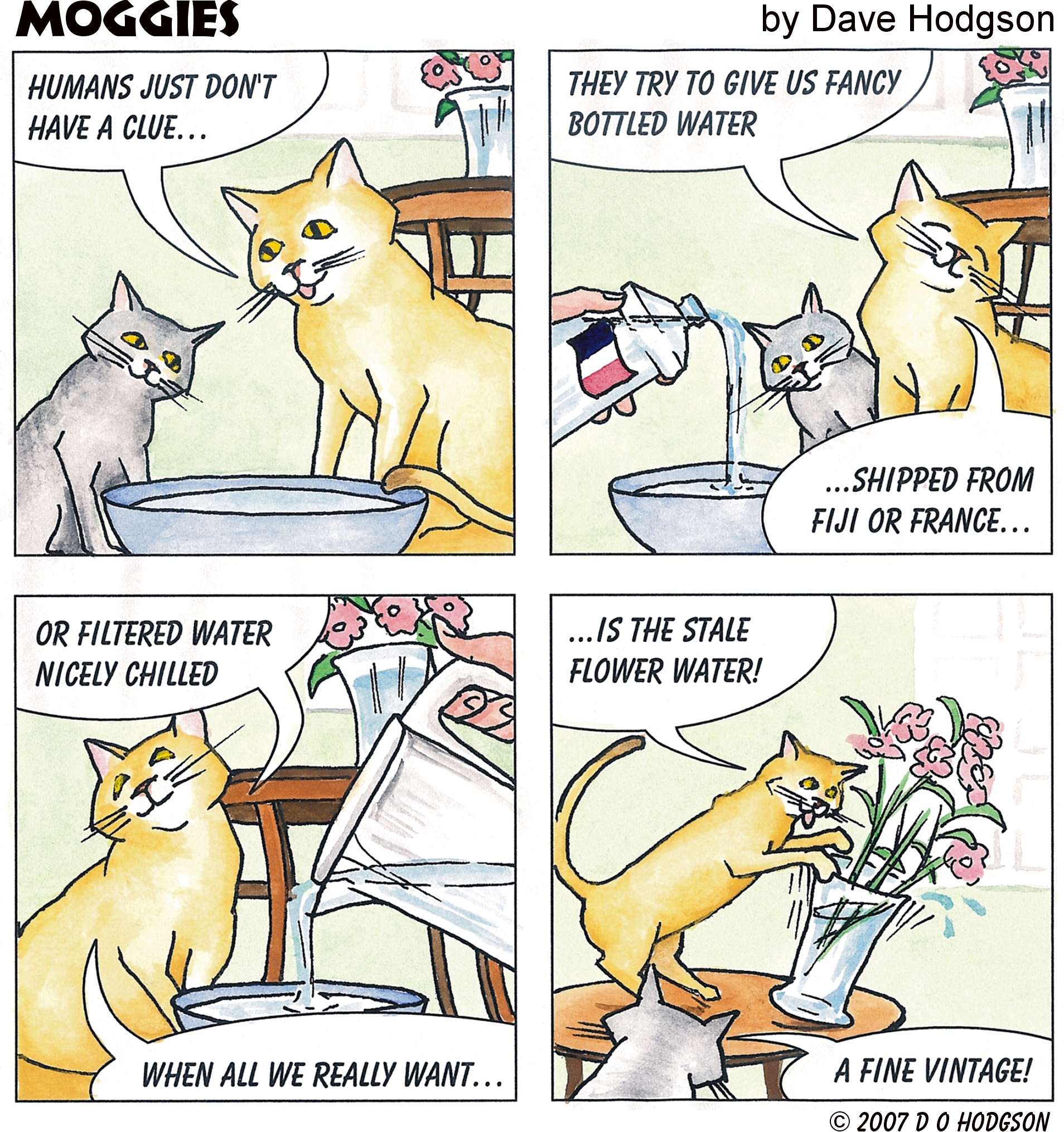
Let’s look at one of the final cartoons, before discussing how it was produced. This was exhibited in an Art Show, where it won a “Best of Show” prize. As you can see, the style looks like a fairly standard comic strip; consisting of colored-in areas over a black outline. There’s nothing remotely avant garde about the design of the strip; it has four rectangular panels, the aim being to make it easy to follow. This was a humorous cartoon, so I wanted the artistic style to be “casual” and light, rather than precise and technically accurate.

The Complete 4-panel Moggies Cartoon

Since I’d be “telling a story” here, the first step of course was to specify the details of the story, and decide how it would be plotted. I’d decided that my strip would have four panels, and I’d use the panels to develop a “gag”. The punch line for the gag would obviously need to be in the fourth panel, with the scenes in the previous three panels providing the lead-up to that.

Comic strips usually adhere to implicit conventions that you need to follow, if you want your readers to be able to follow the strip easily. For example, in English-language countries, we read the strip from top to bottom, and from left to right. It’s important that the conversation “bubbles” in the strip frames should also flow from left to right, so that readers will tend to read each one in the order that is natural for them. Thus, the positions of the cats in each frame of the strip had to be such that it would be possible to place the bubbles in the most readable order.

Firstly then, I wrote out the script for the bubbles in the four frames, without pictures, to ensure that the gag would be understandable. This also established how many bubbles there would need to be.

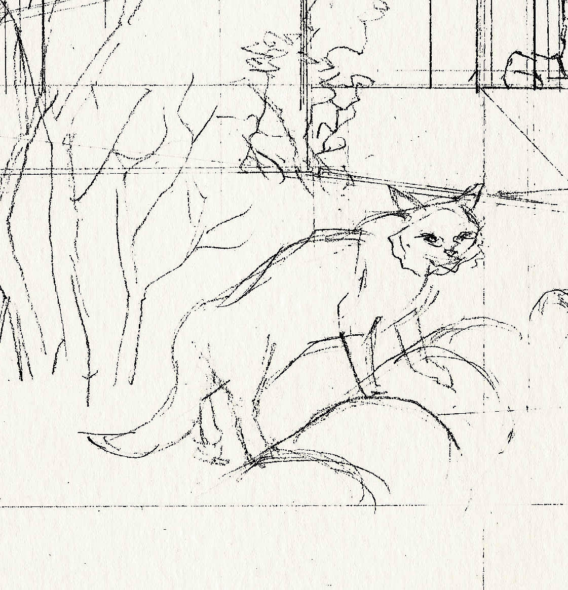
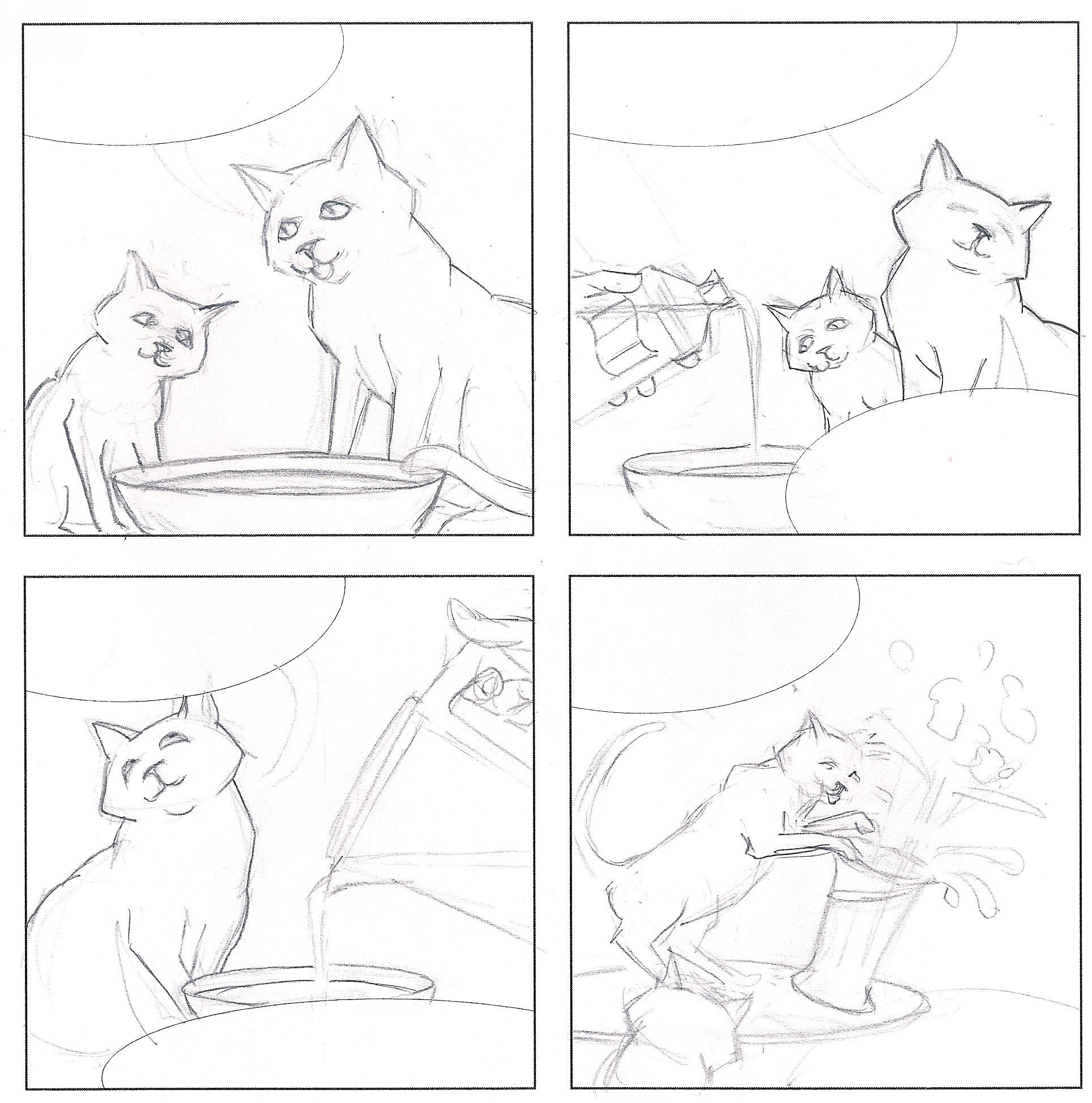
Next, I printed the outlines of the four frames on a sheet of paper (just so I’d be able to erase portions of the drawing without having to redraw the frames). Within the frame outlines, I sketched in the cats in pencil, together with rough ellipses for the positions of the bubbles, as below.

The 4-panel Pencil Sketch for the Moggies Cartoon

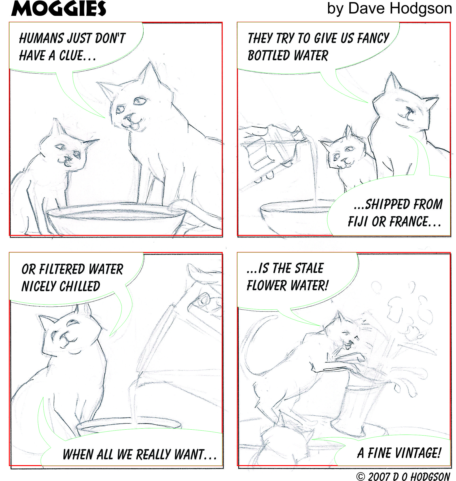
I then scanned my pencil drawing, and imported the scanned bitmap into Corel Draw. I added the bubbles as vector ellipses in Corel Draw (and then trimmed the ellipses with the frame borders, as I described for the gear icon in a previous post). I inserted the text into the bubbles, using an appropriately-named font called “Balloon”, and adjusted everything so that the text fitted neatly into the bubbles. In the working image below, the red and green outlines show the elements that were generated by Corel Draw, over the top of the scanned pencil bitmap.

Speech Bubbles and Outlines added to 4-panel Moggies Cartoon

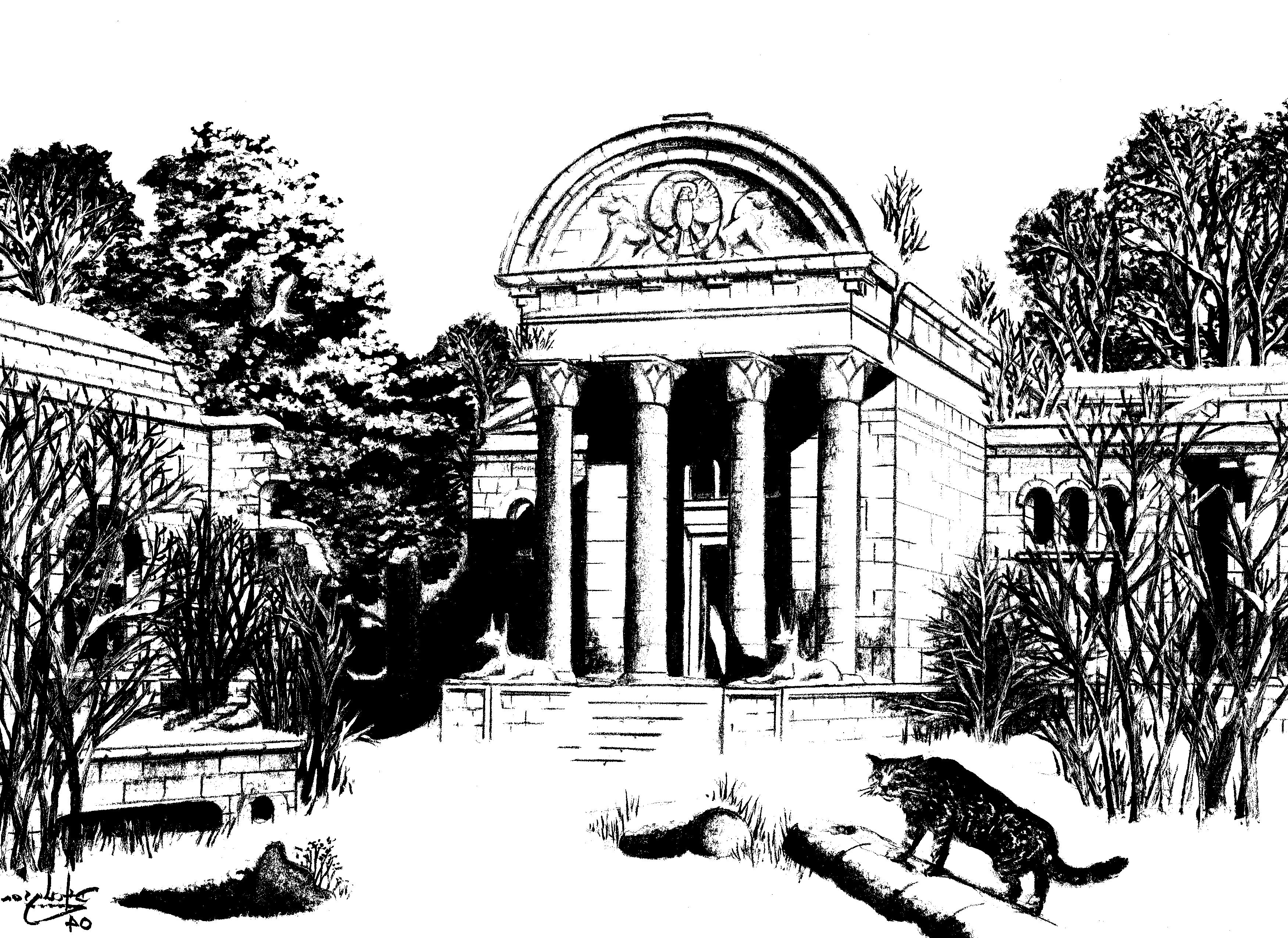
When I’d arranged everything as I wanted, I inked in the original pencil sketch of the cats, as below. Then, I rescanned the inked drawing as below, and imported that into the same Corel Draw file, replacing the previous scanned pencil image.

Inked-in Pencil Drawing for 4-panel Moggies Cartoon

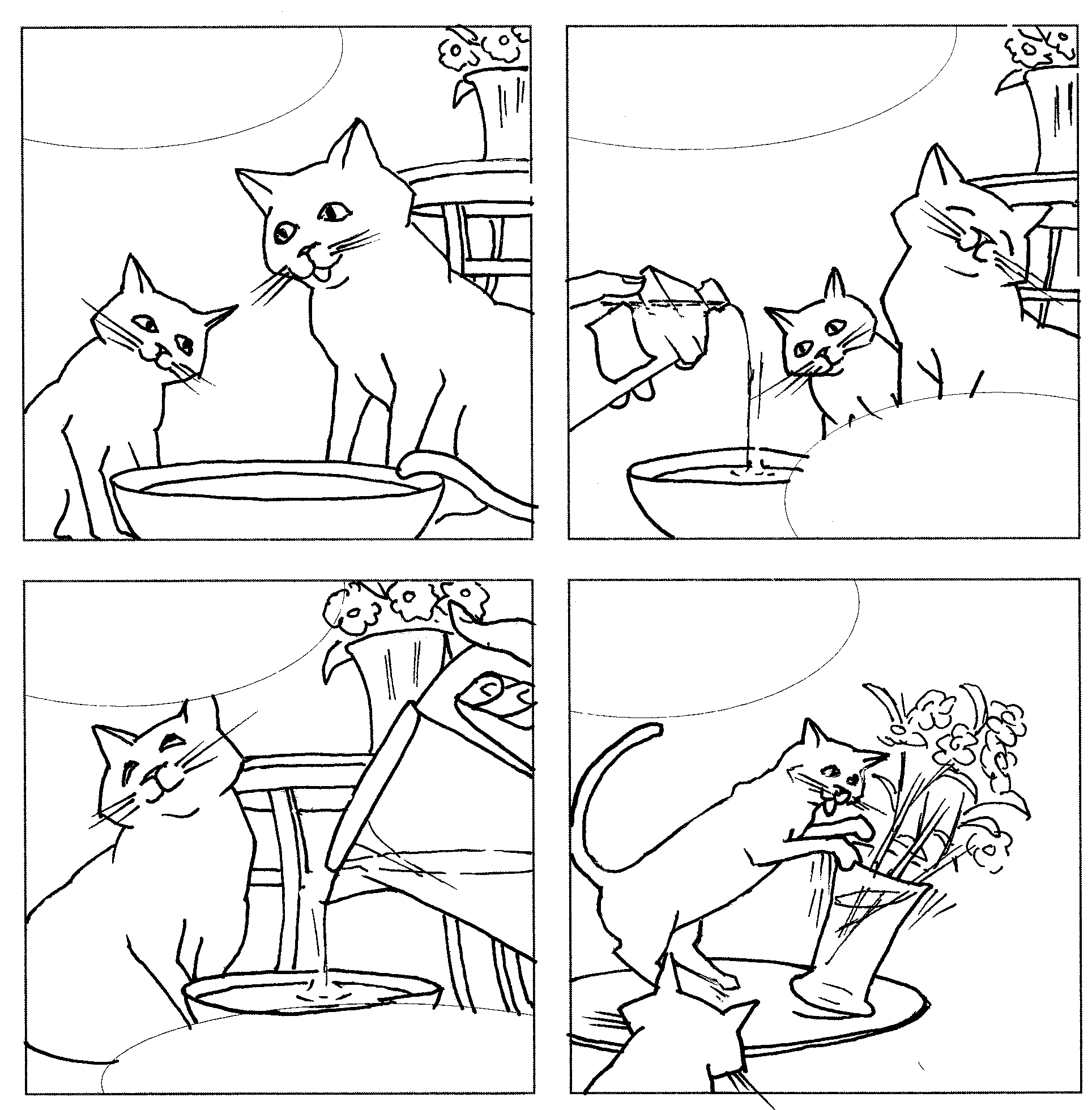
At this point, you may be wondering, “But what about the colors?” Having combined the inked drawing with the computer-generated outlines and text in Corel Draw, I printed out the result on a laser printer. This provided a complete, waterproof outline drawing with text, over which I could paint using watercolors. Of course, I could have colored in the monochrome outline in the Corel Draw image, but I felt that hand-coloring would convey the “casual” style that I wanted.

This post more or less completes my series on computer-assisted artwork production. I do plan to add one more short “postscript” post, describing an very early item of comic strip artwork that I produced in my “pre-computer” days!

Using Computer Techniques to Produce “Conventional” Artwork Efficiently

In the previous post, I described techniques for producing artwork that is intended for use with computers, and intentionally looks like it is computer-produced. In this post, I want to discuss how computer techniques can help you produce more “conventional” artwork more accurately and efficiently.

A few years ago, I set about producing a painting that would show a fictitious ruined Roman temple in Britain, as it might have appeared a century or so after the Roman legions left Britannia. I wanted to show the building glowing in the winter sun, after a snowfall. This idea was inspired by the many medieval monastic ruins that actually exist in North Yorkshire, where I grew up. Many of these buildings were constructed from local sandstone, the honey color of which seems to glow in low sunlight.

The Final Painting

My deliberate goal was to create a conventional painting using watercolor, gouache and colored pencil. I felt that this combination of media would best achieve the lighting effects that I wanted. Here’s the final result, so you can see what I was aiming to achieve.

temple2

The painting was created on paper, on a watercolor block, which is a pad consisting of sheets of paper that are glued on all four sides. The idea of that is to prevent the paper wrinkling when you apply the wet paint to it.

My usual starting point when tackling such work is to draw a light outline in pencil on the blank paper, then adjust the outline as necessary to achieve the composition that I want. When satisfied with the composition, I begin applying paint, erasing the outline as I go so that it doesn’t show through the transparent watercolor.

At this point, you may think that I’m going to tell you that I used a CAD program to design a 3-D model of the building, then created a view of that for the painting. While that would be possible, I didn’t need to spend time doing that in this case, because I understand perspective drawing, and I had a fairly clear idea of what I wanted the building to look like. Instead, it was much quicker for me to establish a couple of vanishing points, then draw perspective lines to delineate the building.

Posing the Cat

One of the elements that I wanted to include in the painting was a “wildcat”, which, in order to be visible, would need to be placed somewhere in the foreground. However, I wasn’t sure what would be the best pose for the cat, or exactly where to place it.

Although we had a large tabby cat who would make a good model for a “wildcat”, he was naturally reluctant to pose in any desired position! I wanted to be able to play around with the size and position of the cat in the final painting. In my “pre-computer” days, I’d have done this manually, by drawing and erasing the cat sketch several times, but it’s much faster to draw an initial sketch, then scan the entire outline and cut out (electronically) the portion with the cat (as below). You can then move that portion around to decide the best position and pose. The computer-assisted method is much faster, and enables you to make more exhaustive experiments before settling on the final design.

wildcatSketch1

A further technique that is much easier with computer assistance is to see your image “with different eyes”. When working on an image for many hours, I sometimes find that I become so familiar with it that I fail to see obvious errors until it’s too late. I can avoid this over-familiarity by scanning the picture, then modifying the scanned image in various ways. In this case, I posterized the scanned image to create a “stipple effect” monochrome version, then flipped the result horizontally, as below.

temple2r1

This allowed me to look at the whole picture afresh, and see whether anything was obviously wrong.

The Lions of Aker (aka the Lions of Yesterday & Tomorrow)

One feature of the painting that immediately strikes most viewers is the unusual segmental shape of the temple’s pediment, contrasting with the usual triangular shape of a classical pediment. The segmental shape was inspired by a real image of an Isean temple on a genuine Roman coin, although I’m aware that the image may not be an accurate depiction of a real building!

I also wanted the pediment to feature a carving showing the “Lions of Aker”, which is an Ancient Egyptian motif. I didn’t want to copy any existing drawing of the lions slavishly, but instead create my own version of the design, as below.

temple_parapet

I wanted the lions to be exact back-to-back reflections of each other. I had a general idea of what I wanted my “heraldic beasts” to look like, so I sketched out one lion freehand, as below, together with part of the central shield that it would be supporting. When I was happy with the shape, I inked in the outline with a thin black pen, so that the image would scan well. The outline isn’t perfect, but it doesn’t need to be.

lionhorizon2

After scanning the image of the one lion and cleaning up the result, it was a simple matter to create a flipped copy of it for the other lion, and then use a vector drawing program (Corel Draw) to insert the central shield as an ellipse. The result was as shown below.

2lionsCrest

Of course, in the painting, we’re not looking at the temple pediment head-on, so the effects of perspective must be taken into account. Therefore, I used Corel Draw’s distortion tools to skew the drawing, approximating the perspective angles that allow it to fit into the picture, as below. It was then simply a case of transferring the final image of the fictitious carving to the watercolor pad, painting it in and adding the shading and fallen snow.

parapet_projection

In the next post in this series, I’m going to discuss how to use computer graphic techniques to help with the production of a humorous comic strip.