Digital Color Palettes: the Essential Concepts


Fantasy Illustration of Computer Artist using Palette for Digital Color Palettes
An Unlikely Computer Artist

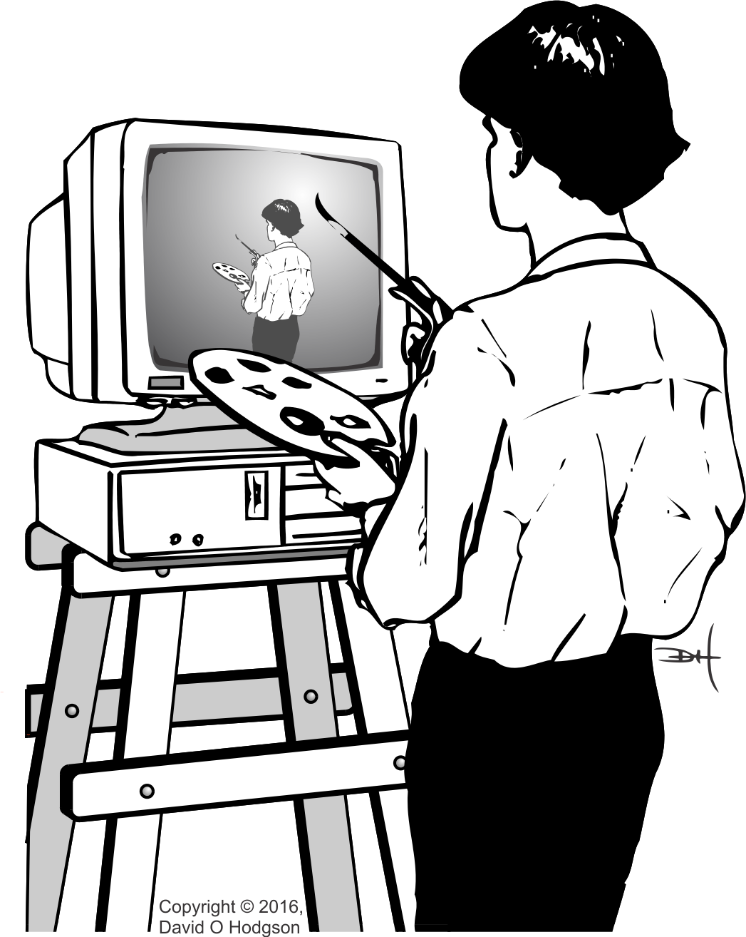
The word “palette” (or “pallet”) has several meanings: it can refer to a tray used to transport items, or to a board used by artists to mix colors (as shown in the fantasy illustration above, which I produced many years ago for a talk on Computer Artwork). In this article, I’ll discuss the principles of Digital Color Palettes. If you’re working with digital graphics files, you’re likely to encounter “palettes” sooner or later. Even though the use of palettes is less necessary and less prevalent in graphics now than it was years ago, it’s still helpful to understand them, and the pros and cons of using them.

Even within the scope of digital graphics, there are several types of palette, including Aesthetic Palettes and Technical Palettes.

I discussed the distinction between bitmap and vector representations in a previous post [The Two Types of Computer Graphics]. Although digital color palettes are more commonly associated with bitmap images, vector images can also use them.

The Basic Concept

A digital color palette is essentially just an indexed table of color values. Using a palette in conjunction with a bitmap image permits a type of compression that reduces the size of the stored bitmap image.

In A Trick of the Light, I explained how the colors you see on the screen of a digital device display, such as a computer or phone, are made up of separate red, green and blue components. The pixels comprising the image that you see on-screen are stored in a bitmap matrix somewhere in the device’s memory.

In most modern bitmap graphic systems, each of the red, green and blue components of each pixel (which I’ll also refer to here as an “RGB Triple” for obvious reasons) is represented using 8 bits. This permits each pixel to represent one of 224 = 16,777,216 possible color values. Experience has shown that this range of values is, in most cases, adequate to allow images to display an apparently continuous spectrum of color, which is important in scenes that require smooth shading (for example, sky scenes). Computers are generally organized to handle data in multiples of bytes (8 bits), so again this definition of an RGB triple is convenient. (About twenty years ago, when memory capacities were much smaller, various smaller types of RGB triple were used, such as the “5-6-5” format, where the red and blue components used 5 bits and the green component 6 bits. This allowed each RGB triple to be stored in a 16-bit word instead of 24 bits. Now, however, such compromises are no longer worthwhile.)

There are, however, many bitmap images that don’t require the full gamut of 16,777,216 available colors. For example, a monochrome (grayscale) image requires only shades of gray, and in general 256 shades of gray are adequate to create the illusion of continuous gradation of color. Thus, to store a grayscale image, each pixel only needs 8 bits (since 28 = 256), instead of 24. Storing the image with 8 bits per pixel (instead of 24 bits) reduces the file size by two-thirds, which is a worthwhile size reduction.

Even full-color images may not need the full gamut of 16,777,216 colors, because they have strong predominant colors. In these cases, it’s useful to make a list of only the colors that are actually used in the image, treat the list as an index, and then store the image using the index values instead of the actual RGB triples.

The indexed list of colors is then called a “palette”. Obviously, if the matrix of index values is to be meaningful, you also have to store the palette itself somewhere. The palette can be stored as part of the file itself, or somewhere else.

To restate, whether implemented in hardware or software, an image that uses a palette does not store the color value of each pixel as an actual RGB triple. Instead, each color value is stored as an index to a single entry in the palette. The palette itself stores the RGB triples. You specify the pixels of a palettized* image by creating a matrix of index values, rather than a matrix of the actual RGB triples. Because each index value is significantly smaller than a single triple, the size the resulting bitmap is much smaller than it would be if each RGB triple were stored.

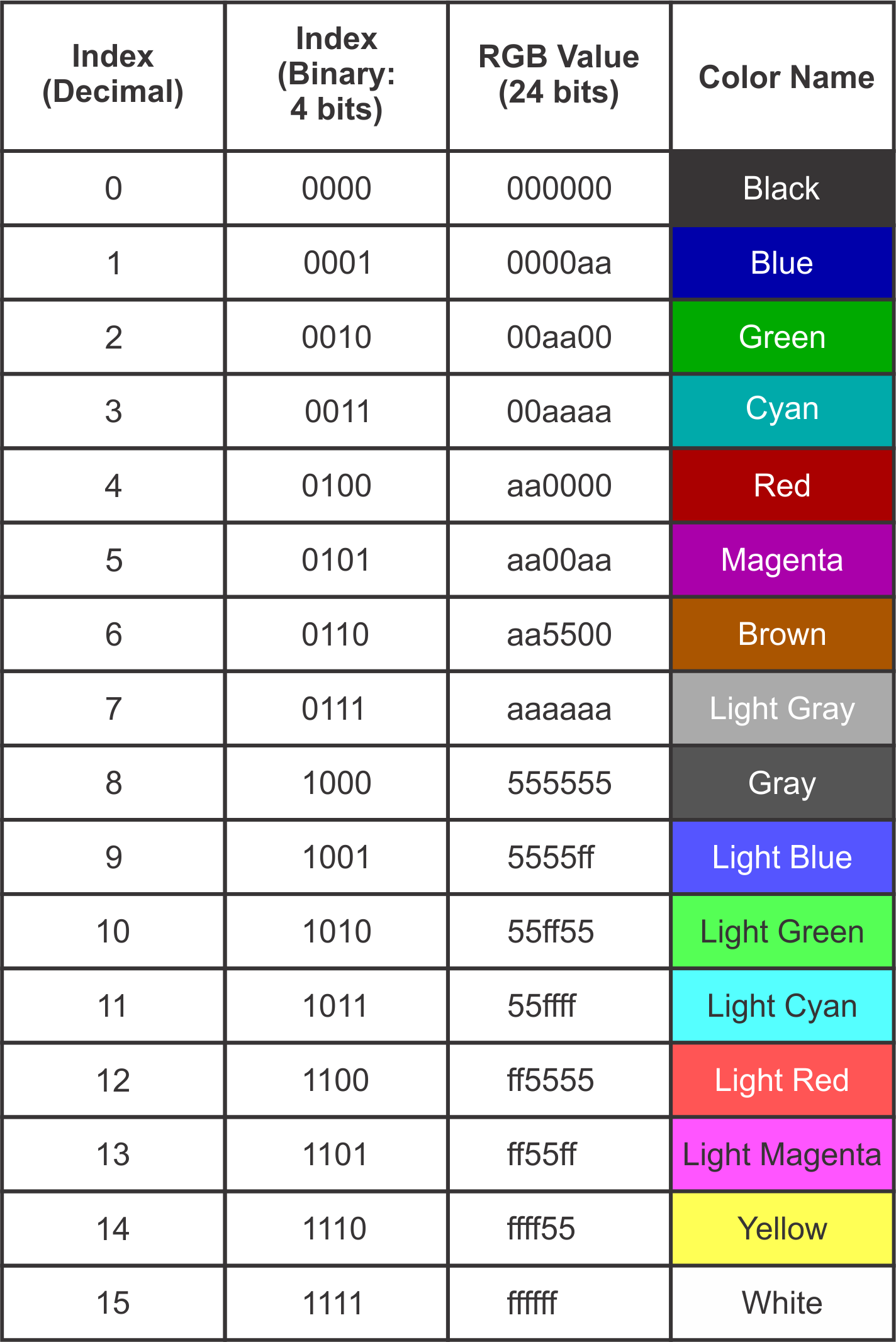
The table below shows the index values and colors for a real-world (albeit obsolete) color palette; the standard palette for the IBM CGA (Color Graphics Adapter), which was the first color graphics card for the IBM PC. This palette specified only 16 colors, so it’s practical to list the entire palette here.

CGA Color Palette Values
CGA Color Palette Table

(* For the action associated with digital images, this is the correct spelling. If you’re talking about placing items on a transport pallet, then the correct spelling is “palletize”.)

Aesthetic Palettes*

In this context, a palette is a range of specific colors that can be used by an artist creating a digital image. The usual reason for selecting colors from a palette, instead of just choosing any one of the millions of available colors, is to achieve a specific “look”, or to conform to a branding color scheme. Thus, the palette has aesthetic significance, but there is no technical requirement for its existence. The use of aesthetic palettes is always optional.

(* As I explained in Ligatures in English, this section heading could have been spelled “Esthetic Palettes”, but I personally prefer the spelling used here, and it is acceptable in American English.)

Technical Palettes

This type of palette is used to achieve some technological advantage in image display, such as a reduction of the amount of hardware required, or of the image file size. Some older graphical display systems require the use of a color palette, so their use is not optional.

Displaying a Palettized Image

The image below shows how a palettized bitmap image is displayed on a screen. The screen could be any digital bitmap display, such as a computer, tablet or smartphone.

Diagram of Palettized Image Display for Digital Color Palettes
Palette-based Display System

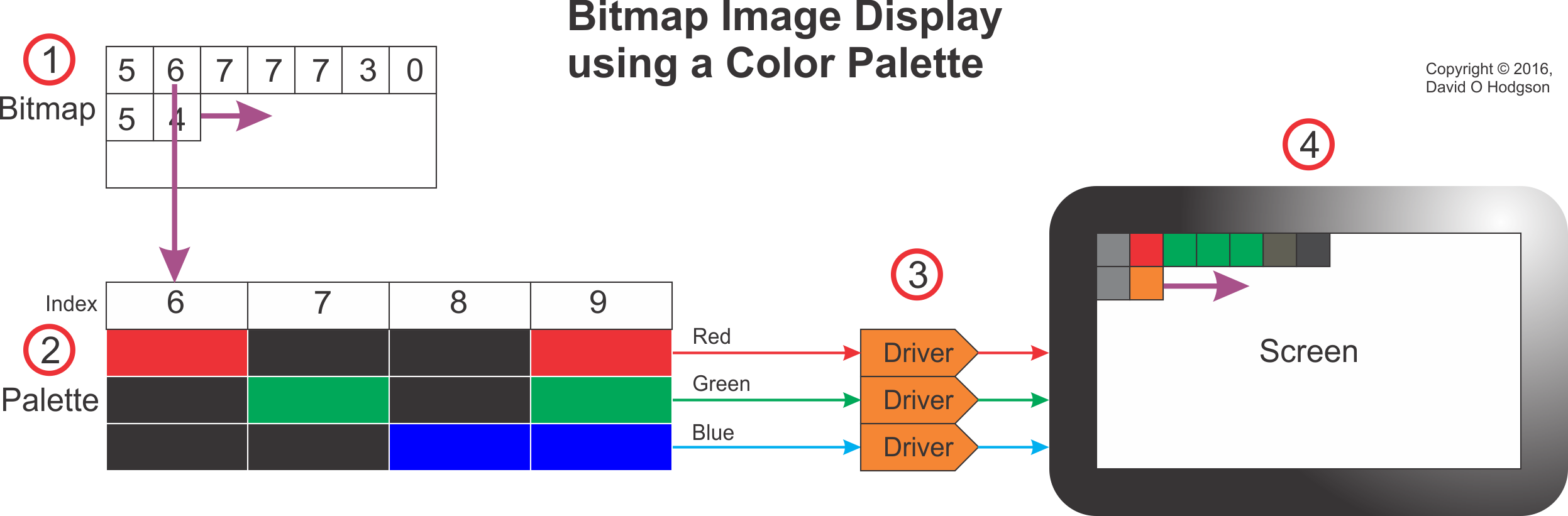
The system works as follows (the step numbers below correspond to the callout numbers in the image):

  1. As the bitmap image in memory is scanned sequentially, each index value in the bitmap is used to “look up” a corresponding entry in the palette.
  2. Each index value acts as a lookup to an RGB triple value in the palette. The correct RGB triple value for each pixel is presented to the Display Drivers.
  3. The Display Drivers (which may be Digital-to-Analog Converters, or some other circuity, depending on the screen technology) create red, green and blue signals to illuminate the pixels of the device screen.
  4. The device screen displays the full-color image reconstituted from the index bitmap and the palette.

Hardware Palette

In the early days of computer graphics, memory was expensive and capacities were small. It made economic sense to maximize the use of digital color palettes where possible, to minimize the amount and size of memory required. This was particularly important in the design of graphics display cards, which required sufficient memory to store at least one full frame of the display. By adding a small special area of memory on the card for use as a palette, it was possible to reduce the size of the main frame memory substantially. This was achieved at the expense of complexity, because now every image that was displayed had to have a palette. To avoid having to create a special palette for every image, Standard color palettes and then Adaptive color palettes were developed; for more details, see Standard vs. Adaptive Palettes below.

One of the most famous graphics card types that (usually) relied on hardware color palettes was the IBM VGA (Virtual or Video Graphics Array) for PCs (see https://en.wikipedia.org/wiki/Video_Graphics_Array).

As the cost of memory has fallen, and as memory device capacities have increased, the use of hardware palettes has become unnecessary. Few, if any, modern graphics cards implement hardware palettes. However, there are still some good reasons to use software palettes.

Software Palette

Generally, the software palette associated with an image is included in the image file itself. The palette and the image matrix form separate sections within one file. Some image formats, such as GIF, require the use of a software palette, whereas others, such as BMP, don’t support palettes at all.

Modern bitmap image formats, such as PNG, usually offer the option to use a palette, but do not require it.

Standard & Adaptive Palettes

Back when most graphics cards implemented hardware palettes, rendering a photograph realistically on screen was a significant problem. For example, a photograph showing a cloud-filled sky would include a large number of pixels whose values are various shades of blue, and the color transitions across the image would be smooth. If you were to try to use a limited color palette to encode the pixel values in the image, it’s unlikely that the palette would include every blue shade that you’d need. In that case, you were faced with the choice of using a Standard Palette plus a technique called Dithering, or else using an Adaptive Palette, as described below.

Standard Palette

Given that early graphics cards could display only palettized images, it simplified matters to use a Standard palette, consisting of only the most commonly-used colors. If you were designing a digital image, you could arrange to use only colors in the standard palette, so that it would be rendered correctly on-screen. However, the standard palette could not, in general, render a photograph realistically—the only way to approximate that was to apply Dithering.

The most commonly-used Standard palette for the VGA graphics card was that provided by BIOS Mode 13H.

Dithering

One technique that was often applied in connection with palettized bitmap images is dithering. The origin of the term “dithering” seems to go back to World War II. When applied to palettized bitmap images, the dithering process essentially introduces “noise” in the vicinity of color transitions, in order to disguise abrupt color changes. Dithering creates patterns of interpolated color values, using only colors available in the palette, that, to the human eye, appear to merge and create continuous color shades. For a detailed description of this technique, see https://en.wikipedia.org/wiki/Dither.

While dithering can improve the appearance of a palettized image (provided that you don’t look too closely), it achieves its results at the expense of reduced image resolution, because of the fact that the dithering of pixel values introduces “noise” into the image. Therefore, you should never dither an image that you want to keep as a “master”.

Adaptive Palette

Instead of specifying a Standard Palette that includes entries for any image, you can instead specify a palette that is restricted only to colors that are most appropriate for the image that you want to palettize. Such palettes are called Adaptive Palettes. Most modern graphics software can create an Adaptive Palette for any image automatically, so this is no longer a difficult proposition.

A significant problem with Adaptive Palettes is that a display device that relies on a hardware palette can typically use only one palette at a time. This makes it difficult or impossible to display more than one full-color image on the screen. You can set the device’s palette to be correct for the first photograph and the image will look great. However, as soon as you change the palette to that for the second photograph, the colors in the first image are likely to become completely garbled.

Fortunately, the days when graphical display devices used hardware palettes are over, so you can use Adaptive Palettes where appropriate, without having to worry about rendering conflicts.

Should you Use Digital Color Palettes?

Palettization of an image is usually a lossy process. As I explained in a previous post [How to Avoid Mosquitoes], you should never apply lossy processes to “master” files. Thus, if your master image is full-color (e.g., a photograph), you should always store it in a “raw” state, without a palette.

However, if you want to transmit an image as efficiently as possible, it may reduce the file size if you palettize the image. This also avoids the necessity to share the high-quality unpalettized master image, which could be useful if you’re posting the image to a public web page.

If it’s obvious that your image uses only a limited color range, such as a monochrome photograph, then you can palettize it without any loss of color resolution. In the case of monochrome images, you don’t usually have to create a custom palette, because most graphics programs allow you to store the image “as 8-bit Grayscale”, which achieves the same result.

In summary, then, in general it’s best not to use palettes for full-color images. However, if you know that your image is intended to contain only a limited color range, then you may be able to save file space by using a palette. Experimentation is sometimes necessary in such cases. You may also want to palettize an image so that you don’t have to make the high-quality original available publicly. If you’re an artist who has created an image that deliberately uses a limited palette of colors, and you want to store or communicate those choices, then that would also be a good reason to use a palettized image.

The Two Types of Computer Graphics: Bitmaps and Vector Drawings

I received some feedback from my previous posts on computer graphics asking for a basic explanation of the differences between the two main ways of representing images in digital computer files, which are:

  • Bitmap “paintings”
  • Vector “drawings”

Most people probably view images on their computers (or phones, tablets or any other digital device with a pictorial interface) without giving any thought to how the image is stored and displayed in the computer. That’s fine if you’re just a user of images, but for those of us who want to create or manipulate computer graphic images, it’s important to understand the internal format of the files.

Bitmap Images

If you’ve ever taken or downloaded a digital photo, you’re already familiar with bitmap images, even if you weren’t aware that that’s what digital photos are.

A bitmap represents an image by treating the image area as a rectangle, and dividing up the rectangle into a two-dimensional array of tiny pixels. For example, an image produced by a high-resolution phone camera may have dimensions of 4128 pixels horizontally and 3096 pixels vertically, requiring 4128×3096 = 12,780,288 pixels for the entire image. (Bitmap images usually involve large numbers of pixels, but computers are really good at handling large numbers of items!) Each pixel specifies a single color value for the image at that point. The resulting image is displayed simply by copying (“blitting”) the array of pixels to the screen, with each pixel showing its defined color.

Some of the smallest bitmap images you’ll see are the icons used for programs and other items in computer user interfaces. The size of these bitmaps can be as small as 16×16 pixels, which provides very little detail, but is sufficient for images that will always be viewed in tiny sizes. Here’s one that I created for a user interface some time ago:

icon16x16_versions2

Enlarging this image enables you to see each individual pixel:

icon16x16_versions_enlarged

You can see the pixel boundaries here, and count them to confirm that (including the white pixels at the edges) the image is indeed 16×16 pixels.

Obviously, the enlarged image looks unacceptably crude, but, since the image would normally never be viewed at this level of magnification, it’s good enough for use as an icon. In most cases, such as digital photographs, there are so many pixels in the bitmap that your eye can’t distinguish them at normal viewing sizes, so you see the image as a continuous set of tones.

Bitmap images have a “resolution”, which limits the size to which you can magnify the image without visible degradation. Images with higher numbers of pixels have higher resolution.

Given that bitmap image files are usually large, it’s helpful to be able to be able to compress the pixel map in some way, and there are many well-known methods for doing this. The tradeoff is that, the more compression you apply, the worse the image tends to look. One of the best-known is JPEG (a standard created by the Joint Photographic Experts’ Group), which is intended to allow you to apply variable amounts of compression to digital photographs. However, it’s important to realize that bitmap image files are not necessarily compressed.

Programs that are designed to process bitmap images are referred to as “paint” programs. Well-known examples are: Adobe Photoshop and Corel PhotoPaint.

Vector Images

The alternative way of producing a computer image is to create a list of instructions describing how to draw the image, then store that list as the image file. When the file is opened, the computer interprets each instruction and redraws the complete image, usually as a bitmap for display purposes. This process is called rasterization.

This may seem to be an unnecessarily complex way to create a computer image. Wouldn’t it just be simpler to stick to bitmap images for everything? Well, it probably wouldn’t be a good idea to try to store a photo of your dog as a vector image, but it turns out that there are some cases where vector images are preferable to bitmap images. Part of the skill set of a digital artist is knowing which cases are best suited to vector images, and which to bitmaps.

There are many vector drawing standards, and many of those are proprietary (e.g., AI, CDR). One open vector drawing standard that’s becoming increasingly popular is SVG (Scalable Vector Graphics). You can view the contents of an SVG file by opening it with a text editor program (such as Notepad).

Here’s a very simple example of an SVG image file, consisting of a white cross on a red circle:

icon_err_gen

(Not all browsers can interpret SVG files, so I rendered the image above as a bitmap to ensure that you can see it!)

If you open the SVG file with a text editor, you can see the instructions that create the image shown above. In this case, the important instructions look like this:

<g id=”Layer_x0020_1″>

<circle class=”fil0″ cx=”2448″ cy=”6098″ r=”83″/>

<path class=”fil1″ d=”M2398 6053l5 -5c4,-4 13,-1 20,5l26 26 26 -26c7,-7 16,-9 20,-5l5 5c4,4 1,13 -5,20l-26 26 26 26c7,7 9,16 5,20l-5 5c-4,4 -13,1 -20,-5l-26 -26 -26 26c-7,7 -16,9 -20,5l-5 -5c-4,-4 -1,-13 5,-20l26 -26 -26 -26c-7,-7 -9,-16 -5,-20z”/>

</g>

As you’d expect, the instructions tell the computer to draw a “circle”, and then create the cross item by following the coordinates specified for the “path” item.

Of course, if you were to try to represent a photograph of your dog as a vector image, the resulting file would contain a huge number of instructions. That’s why bitmap images are usually preferable for digital photographs and other very complex scenes.

A major advantage of vector image formats is that the picture can be rendered at any size without degradation. Bitmap images have inherent resolutions, which vector images do not have.

Programs that are designed to process vector images are referred to as “drawing” programs. Well-known examples are: Adobe Illustrator and Corel Draw.

Converting Between Bitmap and Vector Images

It’s often necessary to convert a vector image into a bitmap image, and, less frequently, to convert a bitmap image into a vector image.

Conversion of vector images to bitmaps occurs all the time, every time you want to view the content of a vector image. When you open a vector image, the computer reads the instructions in the file, and draws the shapes into a temporary bitmap that it displays for you.

Converting bitmaps to vector images requires special software. The process is usually called “Tracing”. Years ago, you had to buy tracing software separately, but now most vector drawing software includes built-in tracing capabilities. As the name suggests, tracing software works by “drawing around” the edges of the bitmap, so that it creates shapes and lines representing the image. The result of the operation is that the software generates a set of mathematical curves that define the vector image.

Summary of the Pros and Cons

There are situations where bitmap images are preferable to vector images, and vice versa. Here’s a summary of the pros and cons of each type.

Bitmap

Advantages:

  • Complex scenes can be depicted as easily as simple scenes.
  • Significant compression is usually possible, at the expense of loss of quality.
  • Rendering is computationally easy; requires minimal computing power.

Disadvantages:

  • Size: Files tend to be large.
  • Not scalable: attempting to magnify an image causes degradation.

Vector

Advantages:

  • Compact: Files tend to be small.
  • Scalable: images can be displayed at any resolution without degradation.

Disadvantages:

  • Complex scenes are difficult to encode, which tends to create very large files.
  • Rendering is computationally intensive; requires significant computing power.

Adapting Drawing Principles for Computer-Generated Artwork

I learned to draw in two “old fashioned” ways. One way was “freehand” with pencil and paper; you just sat down with a blank sheet of paper, and sketched everything out as best your drawing skills would allow. It wasn’t especially precise, but that was acceptable in the context.

The second way was what was called “Geometric” drawing. You still needed a pencil and a piece of paper, but also a drawing board and a tee square, and probably also a pair of compasses, protractor, dividers, etc. If you needed to create a neat, precise drawing, this was the way to achieve it.

My grandfather had been a professional draughtsman [British English spelling, and, yes, it is pronounced “draftsman”!] for the City of Leeds, and that was the way he produced drawings too. I still have a few of his drawing tools, including a pair of brass compasses that pivot around a soldered-on gramophone needle!

Another useful tool for geometric drawing was a set of stencils. These were wooden or plastic templates, offering regular shapes that you could draw around or inside. For example, even the best artists have difficulty drawing an exact circle freehand, so circle templates were useful when these were needed.

These days, of course, I suspect that almost nobody still does geometric drawing with a board and tee square, just because it’s easier to produce the same results, or better, using computers.

When I made the switch from pencil-and-paper drawing to computer artwork generation, I was initially confused about how to translate the techniques I’d learned. Was there a computer equivalent of a pair of compasses, a protractor, and so on? Although there are in fact such equivalents, they’re not necessarily the best way to go about producing a drawing. It took me much time and practice before I learned the best ways to translate conventional geometric drawing techniques into their digital equivalents.

Although I did considerable online research, and bought books on the subject, I was never able to find a tutorial providing a general approach to this kind of drawing problem. Everything I found was either very abstract, or else was a specific set of instructions to enable you to draw “exactly what I already drew”. I didn’t find any of that particularly useful, so I’m offering this post in the hope that it may, in a small way, fill that void for aspiring computer artists.

Creating a Gear Icon

Recently, I needed to produce a “gear icon” drawing for some computer documentation. This type of icon is quite popular these days for the identification of “Settings” controls in software, in a linguistically neutral way. The end result I had in mind was to be as shown below.

gear_synth_final

The tool I’d be using was Corel Draw (similar to Adobe Illustrator), which produces vector drawings. The advantage of vector drawing over bitmap painting (as would be produced by Adobe Photoshop) is that you can draw your original at any scale, and re-scale your final image to any size without loss of resolution. (A vector drawing records shapes as sets of mathematical equations, rather than color values in a matrix of pixels.)

So, how to go about producing this icon? One fact about computer artwork that I learned early on was that there are many ways to produce the same output, so it becomes a question of choosing the most efficient way to produce the result that you want.

It also pays to make maximum use of your software’s built-in drawing “primitives” whenever you can. Any credible vector drawing package includes controls for drawing such basic shapes as rectangles, circles, etc., and most include controls to produce more sophisticated shapes.

To produce the gear icon, I could have drawn out every curve individually, then tried to tweak the result until it was correct, but this would be incredibly slow, and likely produce an imperfect result. Alternatively, I could have started with a circle, then created a “tooth” shape, and attached rotated copies of the tooth to the circle, but this again seemed like a lot of work!

An Efficient Method

Of the available primitive shape controls, the Star tool seemed to produce a result that had the greatest resemblance to my desired result (Adobe Illustrator offers a very similar Star tool). So, I selected the Star tool and drew a regular, 11-point star, as below. The exact proportions of the star didn’t matter in this case, so I just “eyeballed” them. (The fill color used in these samples is for clarity only; you can use any fill type, or none at all.)

gear_synth1

Now I had to trim and modify the basic star shape to make it look more like a gear.

Next, I used the Ellipse tool to draw 3 concentric circles over the star, and centered all the objects vertically and horizontally, as below. The exact diameters of the circles didn’t matter. All that mattered was that the diameter of the outermost circle should be less than that of the star, and the diameters of the other two circles should be respectively larger and smaller than the inner portion of the star, as shown.

gear_synth2

Now, I opened Corel Draw’s Shaping menu to begin combining the basic shapes. Firstly, I selected the outermost circle and used the Intersect control in the Shaping menu to lop off the points of the star, with the result below.

gear_synth3

Next, I selected the outermost remaining circle (above), and used the Weld control in the Shaping menu to merge it with the remains of the star. This “filled in” the inner vertices of the star, to create the gear’s “bottom land”, as below.

gear_synth4

Finally, it was just a question of using the innermost (remaining) circle to punch out the hole in the center. I achieved this by selecting the inner circle, then using the Trim tool in the Shaping menu to remove the center from the remains of the star shape.

Final Drawing

The end result was exactly the shape that I wanted. I’m now able to recolor and resize this vector shape for whatever application I need. Below is an example of the icon applied to a fictitious software button.

gear_synth_example

Just to demonstrate that the hole in the center of the gear icon really is a hole and not an opaque circle, below is an example of the gear icon laid over a bluish square in Corel Draw. The square is covered by the red portion of the icon, but shows through the hole in its center.

gear_synth_overlap

I suppose that there’s an element of “lateral thinking” in these designs, in the sense that you have to start by thinking about the desired end result, then work backwards from there to the primitive shapes supplied by the drawing tool.

In my next post, I plan to discuss how to use computer-aided techniques to assist the production of more “conventional” artwork.