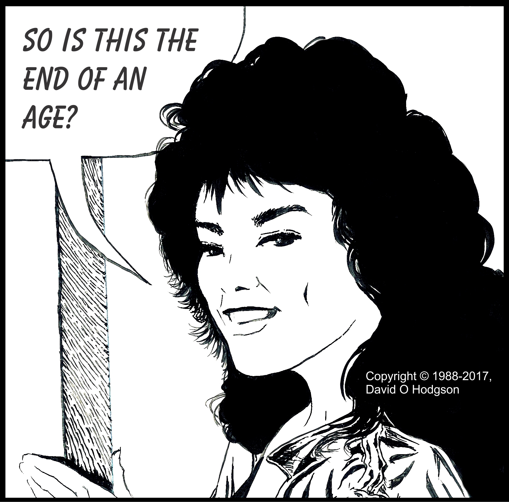
Is this the end of the Age of Monochrome Illustration?
I painted the illustration frame above many years ago using the “standard” comic strip technique; black ink applied onto white card with a brush. At the time, I gave no thought to the idea that that technique might become outdated, and even within my own lifetime.
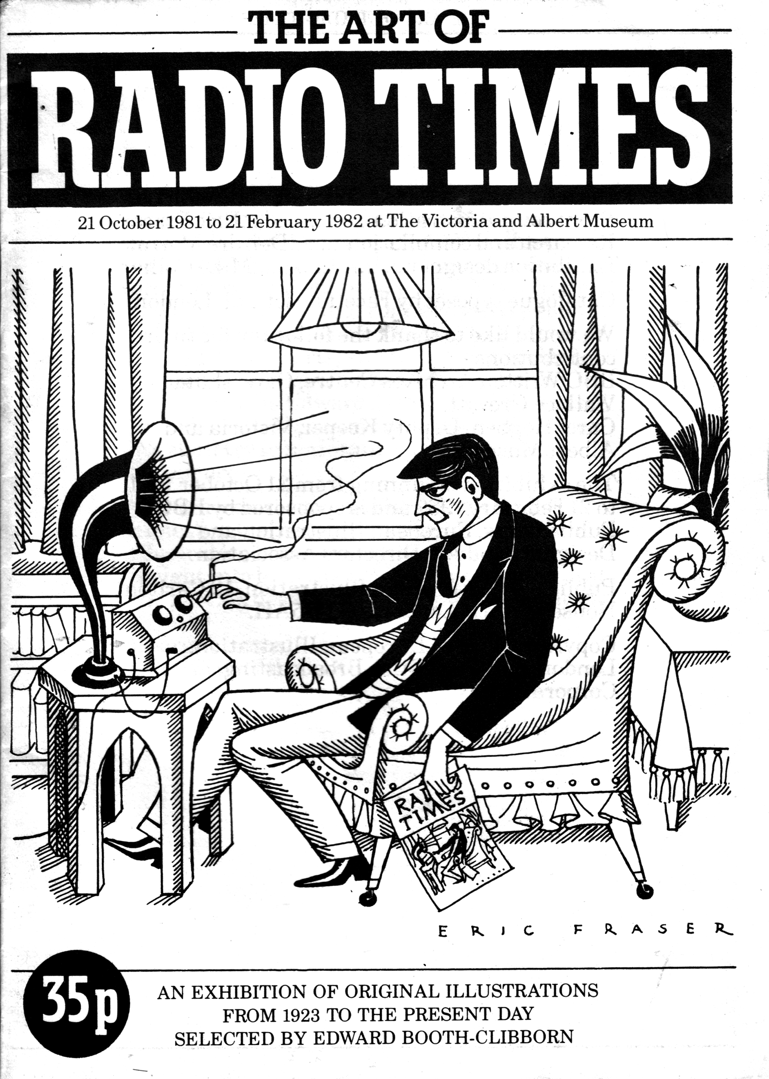
I first learned to use the brush-and-ink technique myself while at university, although I received no formal training in it. I basically figured it out by making several visits to an exhibition of illustrative artwork that displayed work done for the BBC’s house magazine Radio Times. The exhibition took place at the Victoria & Albert Museum, which was just around the corner from Imperial College, and thus was very convenient for me. The front cover of the exhibition catalog is shown below.
Art of Radio Times Exhibition Catalog
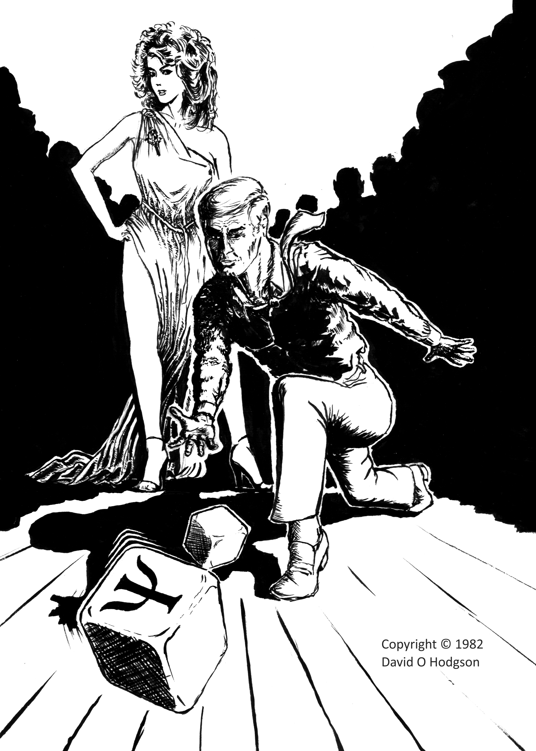
Following that exhibition, my first attempt to use the brush-and-black-ink technique was to illustrate a poster for a lecture titled The Psychology of Gambling. My poster illustration is shown below.
Psychology of Gambling
It was also my responsibility to prepare the print masters for my posters. When preparing the master for the poster above, I learned a valuable lesson about the use of solid expanses of black! Although they do make for a striking design, half-screen reproduction processes didn’t handle them well, so they were best avoided in those days. (Modern printing techniques are less prone to this kind of problem, but it’s still something to bear in mind.)
Ian Ribbons
Recently, I wrote an article about my experiences in an Illustration class that I took at St. Martins School of Art, London, way back in 1982. My tutor for that class was Ian Ribbons, who (unbeknown to me at that time) was a fairly famous British illustrator. (I find it sobering to reflect that he may have been the only art teacher I ever had who was a noted artist in his own right.) My experience in that class, and Mr. Ribbons’ guidance, were immensely helpful to me in developing my own styles and approaches to art projects.
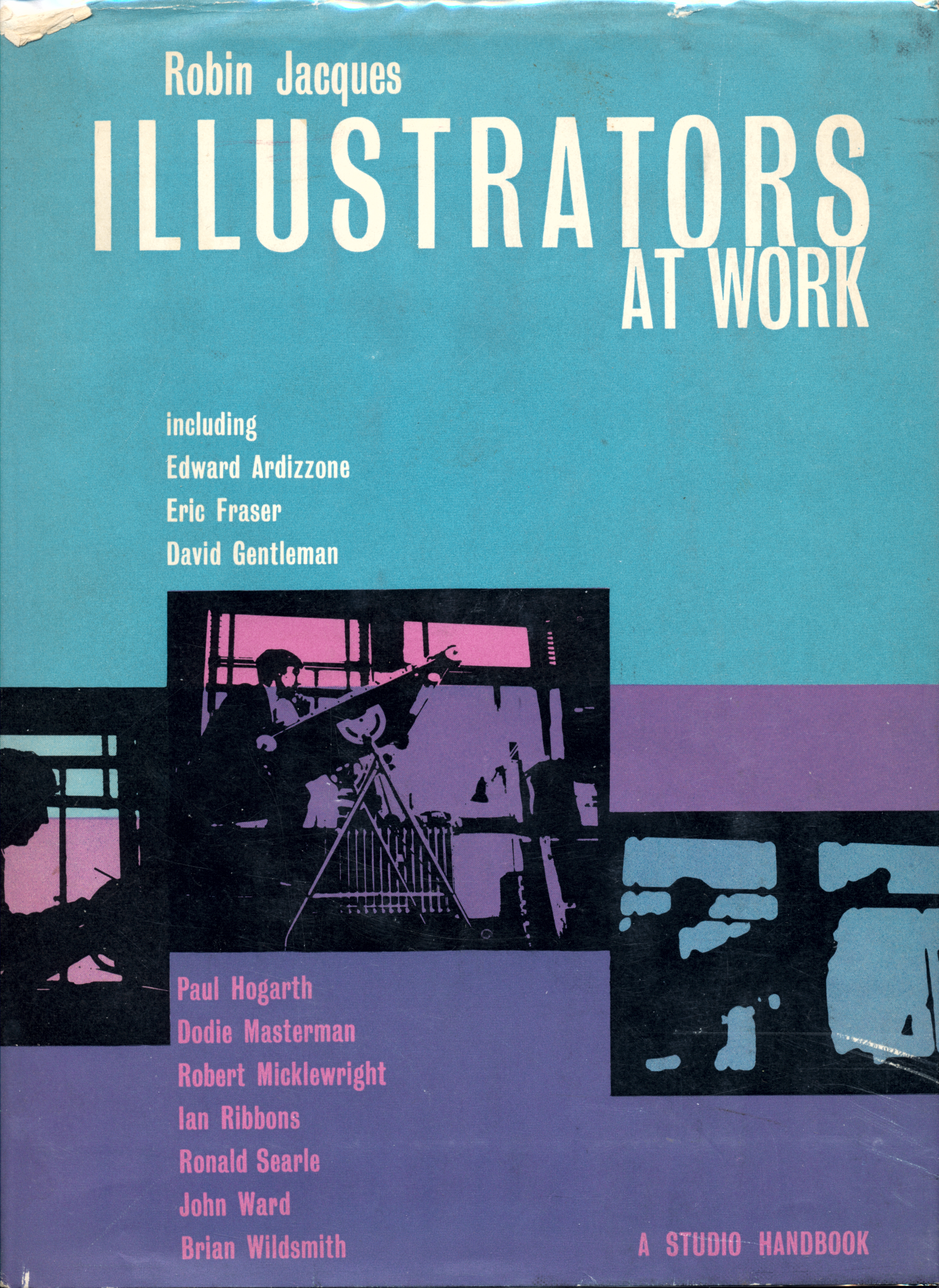
Years later, while browsing in a secondhand bookshop, I came across a copy of a 1963 book by another famous British illustrator, Robin Jacques, in which he compiled biographies and work samples of many contemporary artists (one of whom was Ian Ribbons, which was what drew my attention to the book). The book is called Illustrators at Work, and the front cover is shown below.
Monochrome vs. Black-and-White
The notable but unspoken common characteristic of every art sample in the Illustrators at Work book is that it is not only shown in monochrome (or grayscale in computer terms), but was specifically produced for monochrome-only reproduction.
(Such artwork is typically called “black and white”, but that’s not strictly accurate because much of it includes shades of gray. Here, I’ll use “black and white” to refer only to artwork that literally uses only those two colors, and does not include grays. I’ll use “monochrome” to refer to artwork that consists of gradations from one color—usually black—to white.)
That fact made me think about how much art, illustration and reproduction methods have changed during my lifetime. For most of the twentieth century, it was taken for granted that most artwork for printed reproduction would be monochrome, primarily for economic and technical reasons. Most books, newspapers and magazines were printed entirely or mostly using only black ink, so there was no possibility of reproducing anything in color.
Why Does Monochrome Work?
I notice that very few people stop to consider why we accept some monochrome images as being valid two-dimensional representations of a scene, when we would not accept certain other kinds of monochrome images.
For example, for many years most photographs were monochrome (“black and white”). Provided that the grayscale in the image corresponds to that of the actual scene, the human brain accepts it as valid and can interpret the content, for example by recognizing a face.
However, if the grayscale in the image does not correspond to that in the real scene, the brain cannot interpret it correctly. For example, if shown a monochrome photographic negative, most people would have difficulty identifying a face that they would immediately recognize if shown the corresponding positive image.
Why is this the case?
I described in a previous post how the human visual system relies on various types of light receptor cells within our eyes. One type are called “Rods”, and these provide us with monochrome vision in low light conditions. It is because of this ability that we accept a monochrome image as being a valid representation of a scene; our brains just assume that we’re looking at something in low light.
Reproduction of Illustrations
Until the twentieth century, illustrations that were intended for printed reproduction were often produced using intaglio techniques. This involved the creation of the illustration by literally incising lines onto a metal or wood surface, and thus all shading had to consist of patterns of lines or dots. Perhaps one of the most famous masters of this technique was Sir John Tenniel, who illustrated Lewis Carroll’s “Alice in Wonderland” and similar works.
Last year, I parodied Tenniel’s style to produce a satirical image of a well-known politician throwing a characteristic temper tantrum. Tenniel’s original images of Tweedledum and Tweedledee, which inspired my image, were woodblock cuts, but mine is a pen-and-ink drawing.
Tweedle Don
Limitations Stimulate Creativity
The restriction to a single color, and the inability to print continuous shades of even that one color, forced artists to develop many sophisticated drawing techniques that used black and white patterns to simulate continuous tones, such as cross-hatching and stippling.
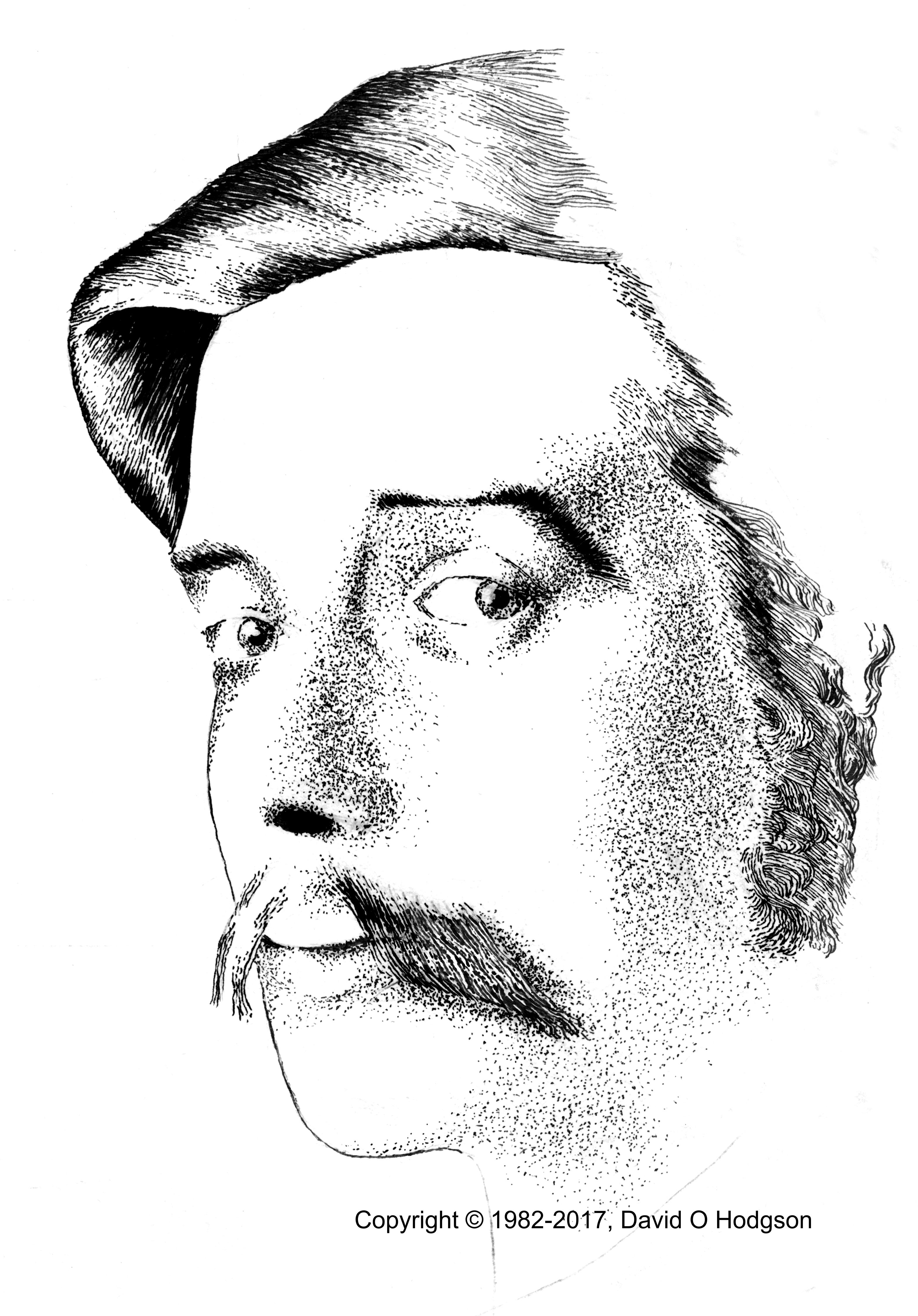
My Tenniel parody above shows samples of cross-hatching, whereas the image below shows a sample of stippling, in my never-finished portrait of the young H G Wells.
Unfinished Portrait of H G Wells
I mentioned above one artist who excelled in such techniques, Robin Jacques. His artwork has appeared in many children’s books and is justly world-famous. Another master of the art was Eric Fraser, whose work appears on the cover of the Art of Radio Times exhibition catalog shown above.
Frank Patterson’s Linework
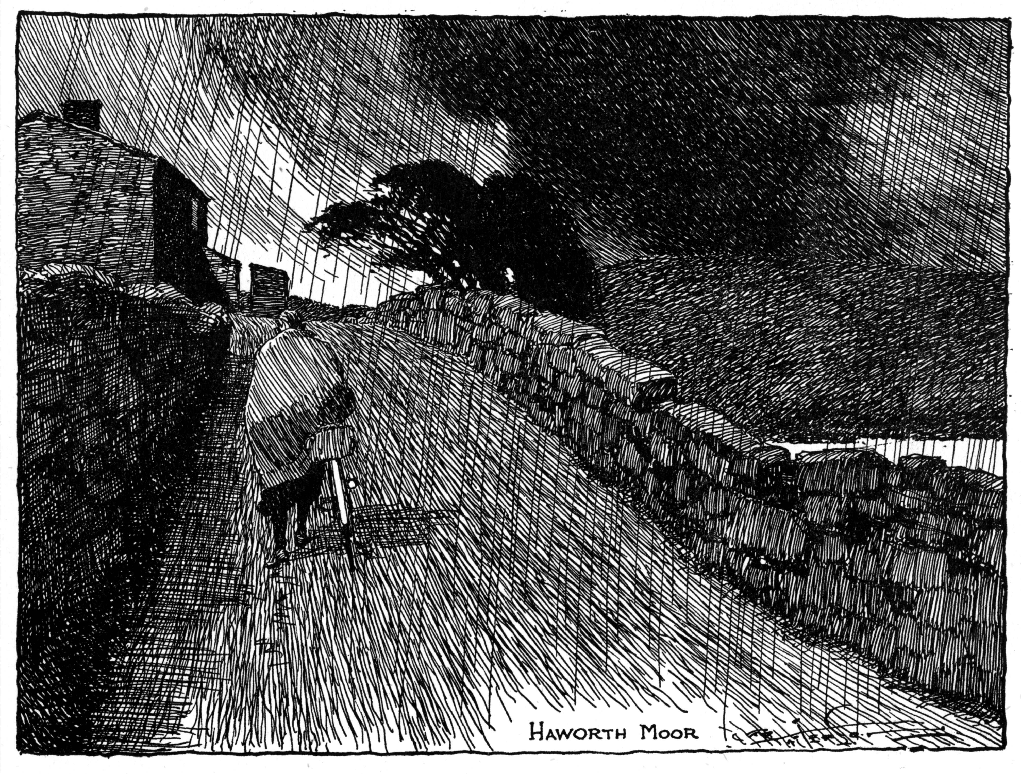
A less famous artist who excelled in monochrome illustration, and particularly in the use of linework, was Frank Patterson, most of whose work was produced for British cycling magazines from the 1920s through the 1940s.
The illustration of a road across Haworth Moor (shown below) is a spectacular sample of how Patterson could create a dynamic and emotive scene merely from black lines. This is clearly one of those cases where a photograph of the scene would probably be far less effective than the artist’s imaginative creation.
Haworth Moor. Copyright Frank Patterson
Conclusion: The Brave New World of Full-Color Illustration
As I mentioned above, the situation now is that, in most publications, there are no restrictions on color reproduction at all. Every image can be reproduced in full color at no additional cost, relative to monochrome reproduction.
While this opens up new creative possibilities for artists, it does mean perhaps that we will never again see the development of ingenious new techniques for monochrome artwork.
This article describes techniques for capturing the screen image of devices using various operating systems, such as Windows, Android, Linux, etc. Most computer users don’t realize that all Operating Systems have built-in functionality to achieve this.
Even if you’re not writing computer documentation or producing artwork, the ability to capture a static image of the screen you’re viewing, or even a video, is a very useful skill. For example, you may want to capture the text of an instant message from the screen of your smartphone, to provide written proof of what messages were actually exchanged during a dispute (which you’ll need when you appear in front of Judge Judy!).
As I said, all Operating Systems have built-in functionality to achieve this, so additional tools are usually not required. However, the feature is partially hardware-dependent, so techniques vary according to the available user interface controls of the device.
I’ll also discuss a few pitfalls of the screen capture process. I’ll show you how you can reduce the size of a captured dialog image without also reducing its quality.
What is a Screen Capture?
As I mentioned in a previous post, when you’re viewing the display of any modern computer, tablet or smartphone device, you’re actually looking at a bitmap image. Therefore, surely it should be possible to copy that bitmap into a file and save it for later use. In principle this should be easy, but in practice there are cases where computer manufacturers and software developers can make it difficult, either intentionally or otherwise.
In most cases, the device’s Operating System provides built-in techniques that you can use to perform screen captures.
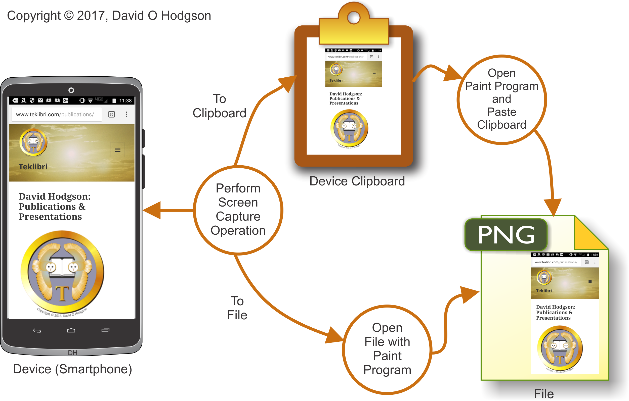
An example of the basic screen capture process is shown in the diagram below.
General Screen Capture Process
As shown in the diagram above, you perform the screen capture operation according to your device’s operating system, which copies the screen bitmap either to a file, or to an area of memory called the Clipboard. If the bitmap was copied to the Clipboard, you open a Paint program and paste it into a blank image. If the bitmap was copied to a file, you can open that file with your Paint program, as you would for any other bitmap image.
(Note: I changed the file type in the diagram above to “PNG” from “JPEG” because, as I explained in my previous post on Mosquitoes, JPEG usually is not a good format choice for saving screen capture images.)
You can also purchase third-party tools to perform screen captures, but many of these simply take advantage of users’ ignorance of the capabilities that are already built into the operating system, and hence available free of charge. Some screen capture utilities do provide additional capabilities; there’s nothing wrong with them, but it’s smart to be aware of what you can do without additional software or cost.
The Two Types of Screen Capture
There are two types of screen capture:
Static. Grab a single bitmap image of the screen content.
Video. Record a segment of screen activity as a digital movie.
Note that, in this article, I’m not specifically discussing the concept of capturing a frame image from a movie that you happen to be watching on your device. While you can use the techniques described here to capture such frames, it’s usually easier to use functionality provided with your video viewing software (such as, for example, Cyberlink PowerDVD).
A Little History
When I started developing Windows software, in the early 1990s, I was creating step-by-step tutorials describing computer setup, so I needed to include many screen captures. I understood what I needed to do, but I didn’t know how to do it, so I searched for screen capture tools. Several were on offer, costing from $70 upwards. However, I soon discovered that Windows came with a built-in screen capture function, which was thus available for free. You simply press the Print Screen key on the keyboard, which causes the screen image to be pasted to the Windows clipboard. Then, you can paste the clipboard image into any bitmap editing program.
Since then, I’ve spent more than a couple of decades developing software, much of which has been for some version of Windows, and it amazes me how many experienced Windows users and developers still don’t know about the Print Screen function! I see people still buying expensive commercial tools, simply to do something that their Operating System can already do.
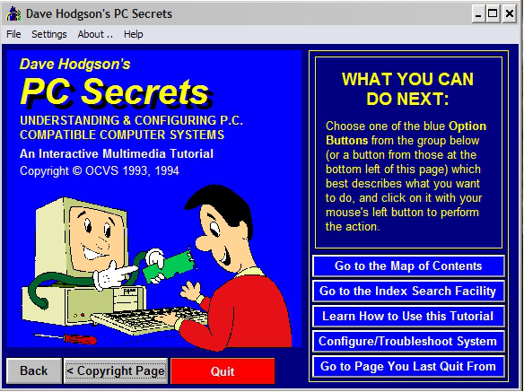
PC Secrets Title Screen
The image above shows a screen capture of the title screen of one of my early “multimedia” productions (“PC Secrets”). I admit that, with the benefit of hindsight, it looks very garish and crude! Bear in mind, though, that given the state of technology at the time, screens had to be readable on monitors that could display only sixteen colors.
Legal Issues & Image Downloading
Most people are aware of the copyright issues that attach to the copying of on-screen images. In principle, just about everything that is displayed on-screen is subject to someone’s copyright. In practice, however, copyright concerns arise only in connection with images that are regarded as having value, such as photographs or artwork.
This article describes techniques for image capture from the device’s display itself, as opposed to the downloading of images from web sites. However, since any image that you download from a web site can be displayed on your device’s screen, you can obviously use screen capture to create copies of downloaded images.
If you can see an Image, you’ve Downloaded it!
You’ll probably encounter some web sites that go to considerable trouble to try to prevent you from downloading images (typically those that display photos or artwork). This has always seemed laughable to me, because, if you’re looking at the image on-screen, then you have already downloaded it! It seems that the web site owners simply hope that their users are too ignorant to know that, or that this was a requirement specified by some manager or “marketing type” ignorant of how computer display technology actually works.
Types of Capture
Static Bitmap
This technique allows you to grab a static bitmap, containing the content of your device’s screen at one instant in time.
All modern operating systems with a graphical user interface provide a built-in means of doing this.
Video
This technique allows you to record a movie of your device’s screen. The movements of anything on the screen while you were recording will be replicated in the movie. This is very useful if you want to create a movie showing computer users how to perform a task.
Most operating systems do not include built-in video recording capabilities, but Windows 10 does now offer such a feature, as described below. If your operating system does not offer video recording capabilities, you can buy third-party tools to add the functionality.
Native Capture Capabilities by Operating System
Screen capture is an area where procedures are heavily dependent on the operating system that you’re using. For example, knowing how to perform a screen capture on a Windows PC is useless when you want to grab the screen of an Android phone. For this reason, I’ve grouped the information below according to operating system.
Note that my practical experience is mostly limited to Windows and Android systems, so, for other operating systems, I’ve taken the information below “on trust” from other sources. Please let me know if something below is inaccurate.
Windows
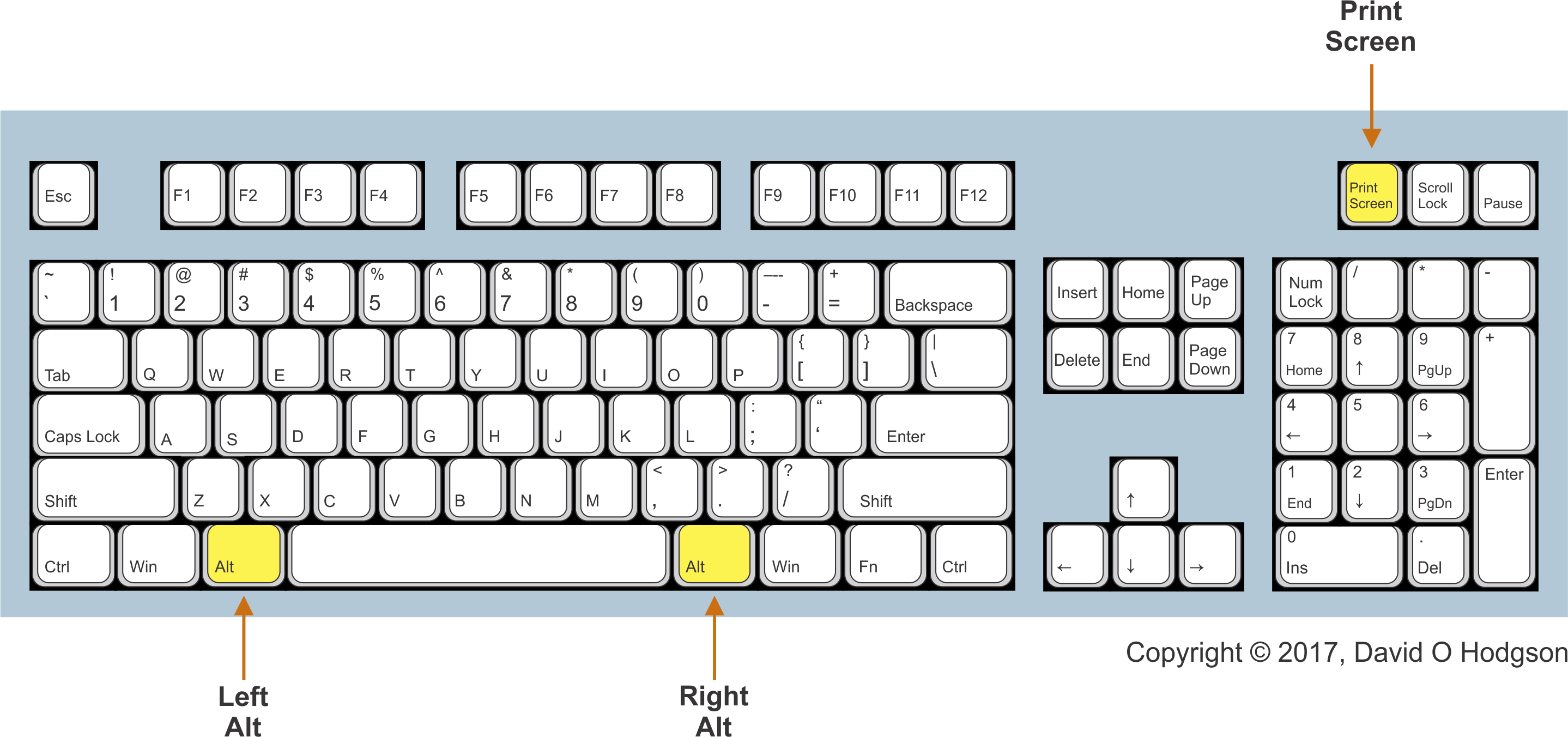
To copy the entire screen area to the clipboard, press the Print Screen key. Note that, if your system has multiple screens, the captured bitmap will span all screens.
To copy the active window to the clipboard, press the Alt+Print Screen keys simultaneously.
After pressing one of these key combinations, open a bitmap editing program (such as the built-in Paint program), then press Ctrl+V to paste the image into the program. You can then save the image as a bitmap file.
The positions of the Left Alt and Right Alt keys, and the Print Screen key, on a typical PC keyboard are as shown below. Typically, whenever a key combination requires use of the Alt key, you can press either the Left Alt or Right Alt keys.
PC Keyboard: Alt and Print Screen key positions
Windows 10
One of the less well-known improvements in Windows 10 is that it offers some new screen capture capabilities, in addition to those described above that existed in previous versions of Windows.
To save a copy of the entire screen to a file in the Screenshots folder, press the Win+Print Screen keys simultaneously.
To save a copy of the active window to a file in the Screenshots folder, press the Win+Alt+Print Screen keys simultaneously.
Video: for the first time, Windows offers a built-in screen recording capability, via the Game Bar. This feature is primarily intended for video game players, but it can also be used as a basic screen video recorder.
Apple (iOS)
I haven’t verified these instructions, which are provided on Apple’s iOS Support site, at:
Press and hold the Sleep/Wake button on the top or side of your device.
Immediately press and release the Home button.
To find your screenshot, go to the Photos app > Albums and tap Camera Roll.
Android
If your smartphone is manufactured by Motorola, Samsung, or one of many others, then it probably uses Google’s Android operating system.
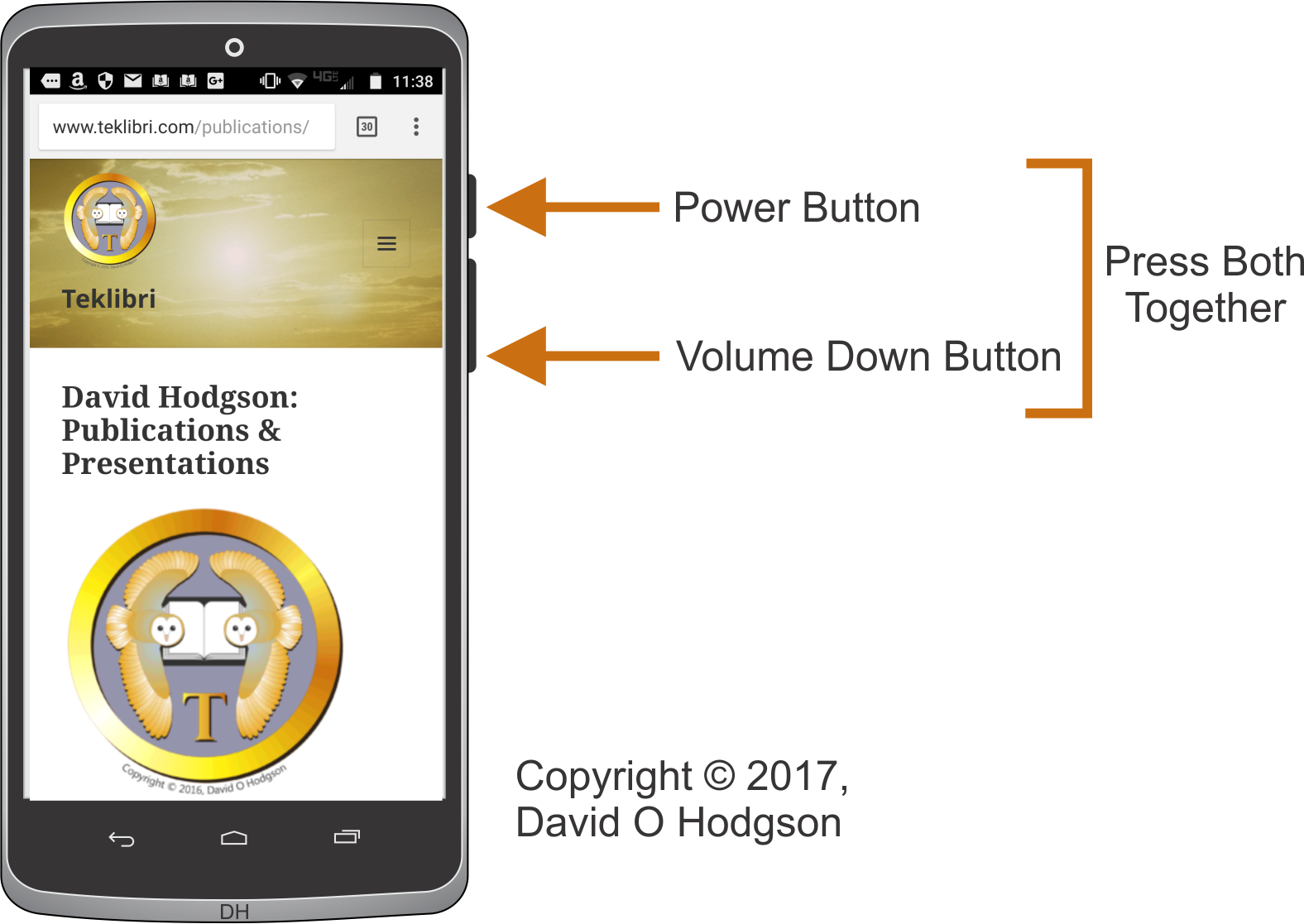
The obvious problem with screen capture in such devices is that they tend to have very few off-screen controls. If you tried to use software to perform a screen capture, then you would obscure part of the screen image that you want. Thus, screen capture usually has to be performed using some combination of the device’s available physical buttons.
Android Screen Capture Process
For devices from many manufacturers, you perform a screen capture by pressing the Power and Volume-Down buttons simultaneously.
This is actually quite tricky to do, and takes some practice.
If you don’t press both buttons at the same time, you’ll end up turning off the device!
HTC, LG, Motorola, Nexus, Sony
Press and hold Power and Volume-down buttons together. A bitmap containing the screen image is created in the Screenshot folder.
Alternatively, for Sony devices only, you can tap the Power button to access options to take a screenshot or screencast in the Power options menu.
Samsung
Press and hold Power and Home buttons together.
Alternatively, enable the ability to take a screenshot with a palm swipe in Settings, Motions & gestures, Palm swipe to capture.
Linux
The basic functionality is similar to that provided in Windows:
Print Screen key: Copy the entire screen area to the clipboard. Note that, if your system has multiple screens, the bitmap will span all screens.
Alt+Print Screen keys: Copy the active window to the clipboard.
Alternatively, you can use the Gnome-screenshot utility, which is part of the GNOME Desktop Environment.
Screen Capture Handling Pitfalls
Once you’ve obtained a “raw” screen capture bitmap, there are various ways that it’s likely that you’ll want to manipulate it. In general, you can use standard bitmap image processing tools and operations for screen captures. Standard tools include Microsoft Paint (included with Windows), Adobe Photoshop, Corel PhotoPaint, etc.
However, there are some additional considerations that can trap the unwary.
Including the Cursor
Generally, the screen cursor is not included in a screen capture. This is usually convenient, because you don’t want an arbitrarily positioned cursor in your image. In cases where you do want to show a cursor in the image, you can paste this in using a paint program later on.
Resizing the Image without Rescaling
I’ve seen many cases where a technical writer uses a screen-captured image in a help publication, but then resizes (reduces) the screen image to fit in some available space, and is surprised and disappointed when the resulting image appears “fuzzy” and sometimes unusable.
Here’s a small example where I’ve deliberately emphasized the poor results that occur when you try to reduce the size of a screen image containing text.
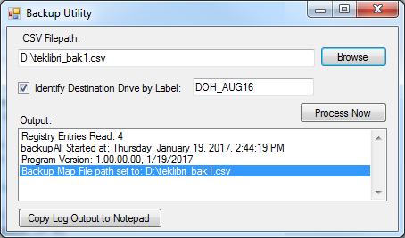
Here’s a dialog that I captured for documentation purposes:
Resizing a Captured Dialog
But the dialog was too large to fit in my document, so I resized it to 50%:
Dialog reduced to 50%
Oh dear! As is obvious, the crisp text in the original image has now become so blurred that it’s almost unreadable. This would be of very limited value in documentation, and it definitely looks unprofessional. I’d be embarrassed to publish an image like this (except for the purposes of this counter-example).
The simple reality is that operating system manufacturers have put a lot of effort into optimizing the appearance of the screen at the intended size and resolution. These screens are not designed for resizing by interpolation methods.
Resizing without Interpolation
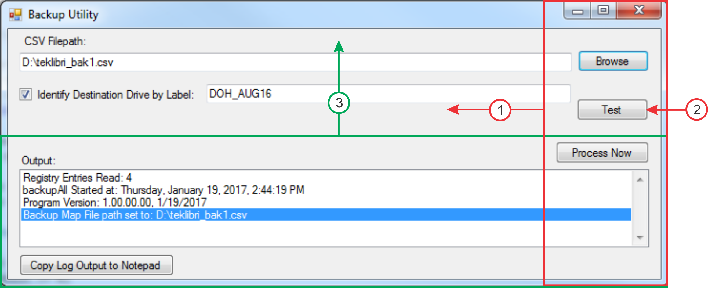
So, if I’m writing documentation and I simply have to make a screen capture image smaller, what can I do? One technique is to use the cut-and-paste features of your paint program to “squeeze up” the important parts of the dialog, so that the controls I want to discuss are still visible, but empty portions of the dialog are omitted. Here’s an example of that technique, applied to the dialog image above:
Dialog Resized without Quality Reduction
Notice that I moved the buttons at the right over to the left, and removed the “Test” button completely. I also moved the lower part of the dialog upwards, eliminating the blank gray area in the original. All the changes here were made in the paint program: I didn’t make any change to the display of the original dialog in the software. Because the dialog image has no noise, I was able to move around the elements seamlessly.
Here is the sequence of operations to resize the dialog as above:
Dialog Resizing Operations
Cut the red rectangle, move it left, and paste it.
Paint out the Test button
Cut the green rectangle, move it up, and paste it.
Trim the entire image to its own new border.
Third-Party Tools
This article does not attempt to offer a comprehensive review of available third-party screen capture utilities. The following is a list of some commonly-used utilities, without any comment as to their quality or features.
This article explained how the ability to capture an image of the screen, or (in some cases) a video of activity on-screen, is built into all modern operating systems. Even without third-party add-ons, you can capture and save screen images from any device.
Now you are armed with the knowledge of how to capture screen images from all your devices! You will never again have to offer up to Judge Judy the lame excuse that “I can’t show you that because my computer/tablet/phone broke”!
When you perform a rotation operation on a bitmap image, such as a digital photograph that you’re trying to straighten, you may sometimes create an undesirable effect called staircasing, where what were apparently straight and smooth edges in the original image become noticeably “stepped” in the rotated result. I noticed this problem recently when I tried to correct a shooting error in the image above (the version above shows the corrected image).
Generally, whenever someone takes a photograph of a natural scene, they attempt to align the camera so that the ground line will appear exactly horizontal, and so that vertical edges in the scene will be truly vertical in the image.
However, the photographer doesn’t always achieve this, and that is becoming a more frequent problem in these days of smaller cameras. When you’re holding up your phone camera, it can be very difficult to ensure that it is exactly perpendicular to the horizon.
There are apps that you can install on your phone that display a “torpedo level” widget, so that you can determine when your device is exactly horizontal, but most people don’t use such apps. In any case, once a photo has been taken, you usually can’t go back and take it again.
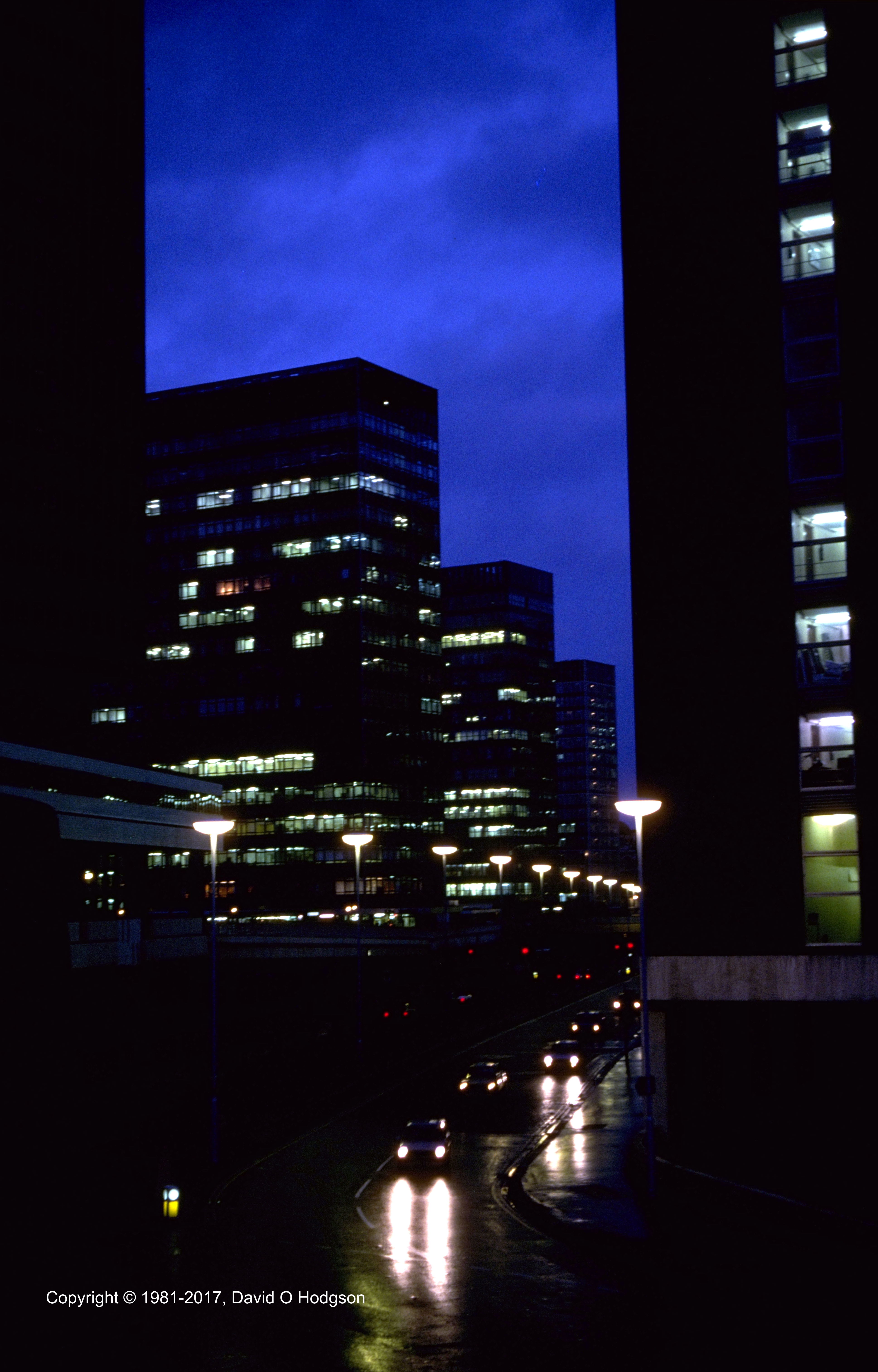
Below is an example of an image where what should be vertical edges are not quite vertical, due to the angle at which the camera was held when the photograph was taken. I took this photo in London in 1981, and since then many of the buildings in the picture have been demolished, so there’s zero chance of being able to retake the photo!
Uncorrected Image
If you look closely at the image above, you can see that what should be a vertical edge nearest to the centerline of the picture is not quite vertical. It’s tilted about 1° counter-clockwise. In theory, it’s easy to fix this by rotating the entire image 1° clockwise. However, if this is not done carefully, staircasing effects can result.
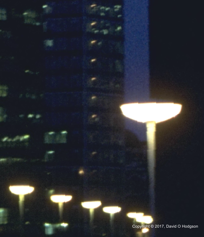
Below is an example of visible staircasing in a portion of the rotated image, resulting from an attempt to straighten the verticals in the original. (This is an enlargement to show the effect.) Notice the jagged transitions where the bright lamps contrast with the dark background.
Staircasing Effect in Bitmap Image
How can you avoid this undesirable effect? Below, I offer a couple of solutions, but it’s important to bear in mind these overriding principles:
Except for rotations in multiples of 90°, you should avoid rotating images unless absolutely necessary, because most rotations result in loss of detail.
If you must rotate an image, perform only one rotation to achieve the final result, because each individual rotation introduces errors. For example, if you want to rotate your image by 3°, do that as one 3° operation rather than three consecutive 1° operations.
Staircasing: the Cause
As I explained in an earlier post, when you take a digital photograph, your camera creates a rectangular bitmap matrix of colored “dots” or pixels. The color value of each pixel is determined by the color of light shining on that particular detector in the sensor.
If you subsequently want to change the mapping of the color values to the bitmap matrix, as happens if you want to resize or rotate the image, then there has to be a way to determine the new color value of each pixel in the modified image.
The simplest way to determine the new color value of each pixel is simply to pick the value of the nearest corresponding pixel in the original image. (This is called Nearest-Neighbor Interpolation.) However, in areas of the image where there are sharp transitions of color, this method can lead to jagged edges and the effect called Staircasing.
(If you rotate a bitmap through some exact multiple of 90°, then this effect does not appear, because the original rectangular matrix maps exactly to a new rectangular matrix. The discussion here relates to rotations that are not a multiple of 90°.)
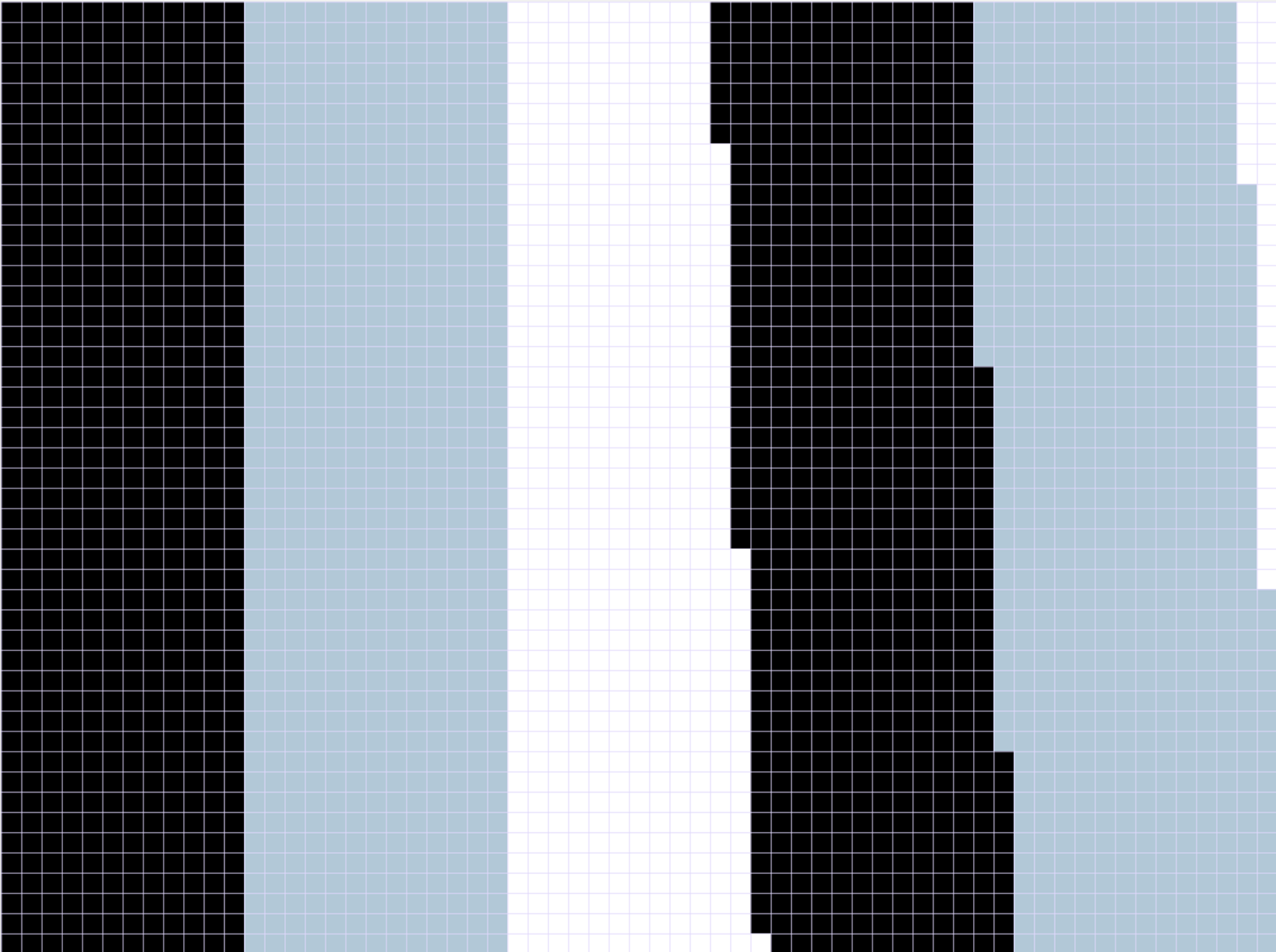
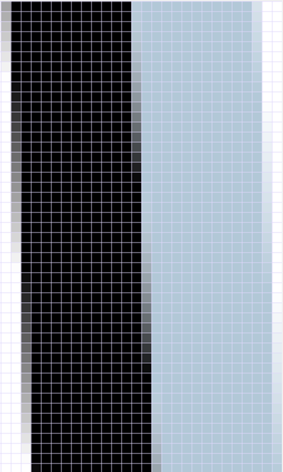
The following example shows a simple case of this problem. In these images, I’ve deliberately enlarged everything to the point that you can see the individual pixel boundaries; you would rarely see these at normal viewing magnifications. I’ve also tilted an edge that was originally vertical into a non-vertical position, rather than vice versa, because this shows the effect more plainly.
In the first image, on the left is the original unrotated image, which consists only of a dark rectangle abutting a light-colored rectangle. The transition between the two colors is a vertical edge, which maps neatly to the vertical alignment of the pixels.
Rotation of Bitmap without Interpolation
On the right above is the result of rotating this image by 1 degree counter-clockwise, without any interpolation. Each new pixel takes the color value of the nearest pixel in the original image. Since the transition between the colors no longer maps neatly into vertically-aligned pixels, a jagged edge transition has now been created.
To reduce the quantization effects, a more sophisticated way of determining the new pixel values is by interpolation. Interpolation is basically a sophisticated form of averaging, whereby the color value of each interpolated pixel is determined by averaging the values of the nearest few pixels in the original image.
Here’s the same rotation operation, but with interpolation applied:
Rotated Bitmap with Interpolation
As you can see, the jaggedness is reduced, although there are still visible discontinuities, due to the small number of pixels involved.
Staircasing: the Solution
As demonstrated above, the staircasing effect is caused by inadequate interpolation of color values between adjacent pixels in a bitmap. If the interpolation could somehow be made perfect, the problem would not occur.
Typically, when we rotate an image, we’re using third-party software, and we’re stuck with whatever interpolation algorithm has been provided by the software manufacturer (which may consist of no interpolation at all). Thus, we can’t improve the interpolation, so all we can do is to take steps to disguise the problem.
Whenever you notice staircasing in a rotated image, the first thing to check is whether interpolation was applied during the rotation operation. Depending on the software you used to perform the rotation, interpolation may not have been applied by default, or, in the case of some low-end software, it may not even be available.
Look for an “interpolation” setting in your software. In some cases, this is referred to as “anti-aliasing”, even though there isn’t really any “aliasing” in this case. Make sure that “interpolation” or “anti-aliasing” are switched on.
Solution #2: Increase Image Resolution
If using interpolation doesn’t work, then the second approach is to try to reduce the quantization artefacts by temporarily increasing the Image Resolution. Most modern bitmap processing (“Paint”) software allows you to do this quite easily.
The procedure is as follows:
Use your paint software to increase the image DPI. To minimize the amount of unnecessary interpolation required, it’s usually best to set the new DPI value to be an exact multiple of the current value. For example, if the image currently has 72 DPI, try increasing to four times that (288 DPI), or another higher multiple. (In general, the higher the DPI, the better, but of course increasing the resolution increases the total image size, so processing takes longer and requires more memory.)
Perform the rotation operation.
Reduce the image DPI back to the original value.
Evaluate the results. If staircasing is still visible, repeat from Step 1, but this time increase the image DPI to an even higher multiple of the original.
Use Your Own Judgment
Ultimately, fixing this problem is a matter of aesthetic judgment; you have to view the results and decide when they’re good enough. What’s good enough in one situation may not be good enough in another.
I hope that my explanation has been helpful, but, if you need more detail, here is a very good post describing these concepts.
Definition: Image Size, Dimensions and Resolution
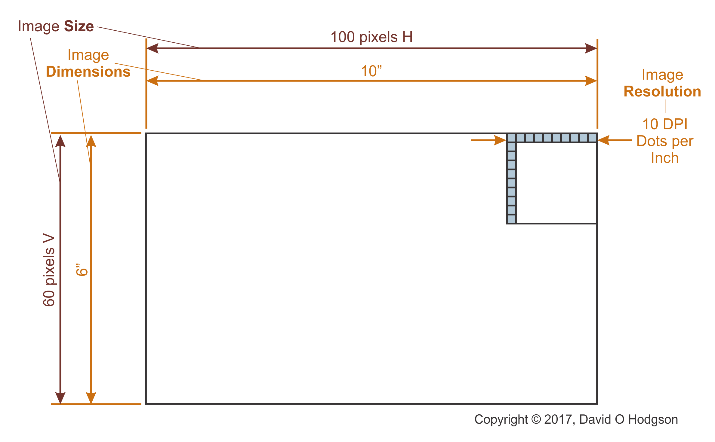
It may be helpful to remind ourselves of the differences between bitmap image size, dimensions and resolution. In my experience, these important distinctions can cause immense confusion to people working with bitmap images. That is not helped by the fact that some of these terms are used loosely and interchangeably in existing documentation, which merely adds to the confusion.
Each pixel in a bitmap image has a constant color value. The illusion that the colors in the image vary continuously occurs because the image typically consists of a very large number of pixels.
It’s intuitively obvious that each bitmap has a particular “size”, but what exactly does that term mean in this context? There’s more to it than just the number of pixels in the matrix, because that does not specify the size at which the bitmap is supposed to be viewed.
Note that these are my definitions of the terms, and you may find varying definitions in other documentation. The important point is to understand what is meant by each term, rather than which term is used for which concept.
Definitions
Image Size: The width and height of the image (W x H) in pixels
Image Dimensions: The width and height of the image (W x H) in measurement units
Image Resolution: Dots Per Inch. It is possible for an image to have different horizontal and vertical DPI values, but this is rarely done in practice. The horizontal and vertical resolutions are usually the same.
Definition: Interpolation
Interpolation is a mathematical concept, which involves creating new data points between the data points of an existing set.
When applied to images, interpolation usually involves creating a new pixel color value by averaging the values of nearby pixels, according to some algorithm.
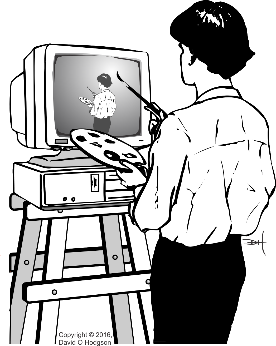
The word “palette” (or “pallet”) has several meanings: it can refer to a tray used to transport items, or to a board used by artists to mix colors (as shown in the fantasy illustration above, which I produced many years ago for a talk on Computer Artwork). In this article, I’ll discuss the principles of Digital Color Palettes. If you’re working with digital graphics files, you’re likely to encounter “palettes” sooner or later. Even though the use of palettes is less necessary and less prevalent in graphics now than it was years ago, it’s still helpful to understand them, and the pros and cons of using them.
I discussed the distinction between bitmap and vector representations in a previous post [The Two Types of Computer Graphics]. Although digital color palettes are more commonly associated with bitmap images, vector images can also use them.
The Basic Concept
A digital color palette is essentially just an indexed table of color values. Using a palette in conjunction with a bitmap image permits a type of compression that reduces the size of the stored bitmap image.
In A Trick of the Light, I explained how the colors you see on the screen of a digital device display, such as a computer or phone, are made up of separate red, green and blue components. The pixels comprising the image that you see on-screen are stored in a bitmap matrix somewhere in the device’s memory.
In most modern bitmap graphic systems, each of the red, green and blue components of each pixel (which I’ll also refer to here as an “RGB Triple” for obvious reasons) is represented using 8 bits. This permits each pixel to represent one of 224 = 16,777,216 possible color values. Experience has shown that this range of values is, in most cases, adequate to allow images to display an apparently continuous spectrum of color, which is important in scenes that require smooth shading (for example, sky scenes). Computers are generally organized to handle data in multiples of bytes (8 bits), so again this definition of an RGB triple is convenient. (About twenty years ago, when memory capacities were much smaller, various smaller types of RGB triple were used, such as the “5-6-5” format, where the red and blue components used 5 bits and the green component 6 bits. This allowed each RGB triple to be stored in a 16-bit word instead of 24 bits. Now, however, such compromises are no longer worthwhile.)
There are, however, many bitmap images that don’t require the full gamut of 16,777,216 available colors. For example, a monochrome (grayscale) image requires only shades of gray, and in general 256 shades of gray are adequate to create the illusion of continuous gradation of color. Thus, to store a grayscale image, each pixel only needs 8 bits (since 28 = 256), instead of 24. Storing the image with 8 bits per pixel (instead of 24 bits) reduces the file size by two-thirds, which is a worthwhile size reduction.
Even full-color images may not need the full gamut of 16,777,216 colors, because they have strong predominant colors. In these cases, it’s useful to make a list of only the colors that are actually used in the image, treat the list as an index, and then store the image using the index values instead of the actual RGB triples.
The indexed list of colors is then called a “palette”. Obviously, if the matrix of index values is to be meaningful, you also have to store the palette itself somewhere. The palette can be stored as part of the file itself, or somewhere else.
To restate, whether implemented in hardware or software, an image that uses a palette does not store the color value of each pixel as an actual RGB triple. Instead, each color value is stored as an index to a single entry in the palette. The palette itself stores the RGB triples. You specify the pixels of a palettized* image by creating a matrix of index values, rather than a matrix of the actual RGB triples. Because each index value is significantly smaller than a single triple, the size the resulting bitmap is much smaller than it would be if each RGB triple were stored.
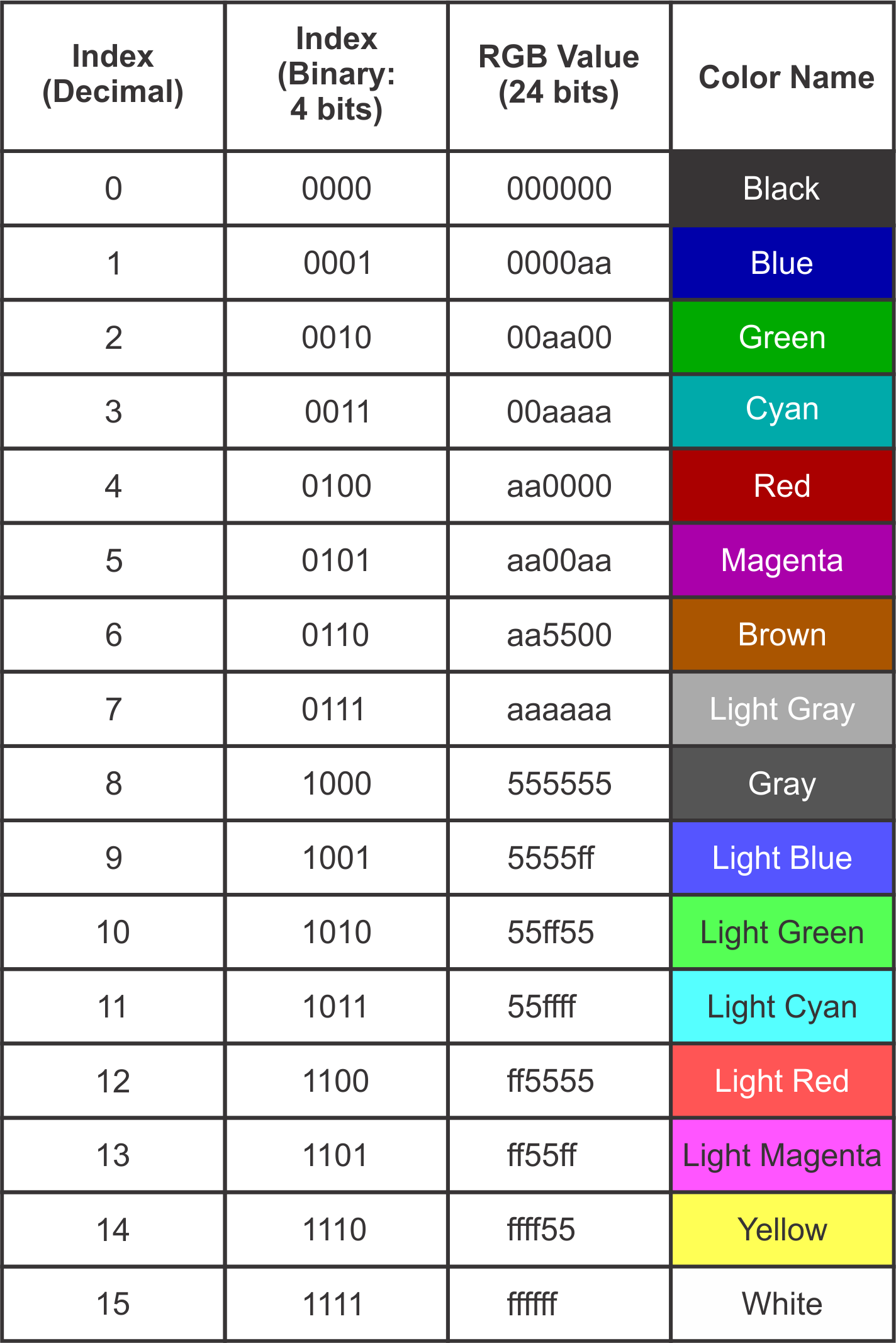
The table below shows the index values and colors for a real-world (albeit obsolete) color palette; the standard palette for the IBM CGA (Color Graphics Adapter), which was the first color graphics card for the IBM PC. This palette specified only 16 colors, so it’s practical to list the entire palette here.
CGA Color Palette Table
(* For the action associated with digital images, this is the correct spelling. If you’re talking about placing items on a transport pallet, then the correct spelling is “palletize”.)
Aesthetic Palettes*
In this context, a palette is a range of specific colors that can be used by an artist creating a digital image. The usual reason for selecting colors from a palette, instead of just choosing any one of the millions of available colors, is to achieve a specific “look”, or to conform to a branding color scheme. Thus, the palette has aesthetic significance, but there is no technical requirement for its existence. The use of aesthetic palettes is always optional.
(* As I explained in Ligatures in English, this section heading could have been spelled “Esthetic Palettes”, but I personally prefer the spelling used here, and it is acceptable in American English.)
Technical Palettes
This type of palette is used to achieve some technological advantage in image display, such as a reduction of the amount of hardware required, or of the image file size. Some older graphical display systems require the use of a color palette, so their use is not optional.
Displaying a Palettized Image
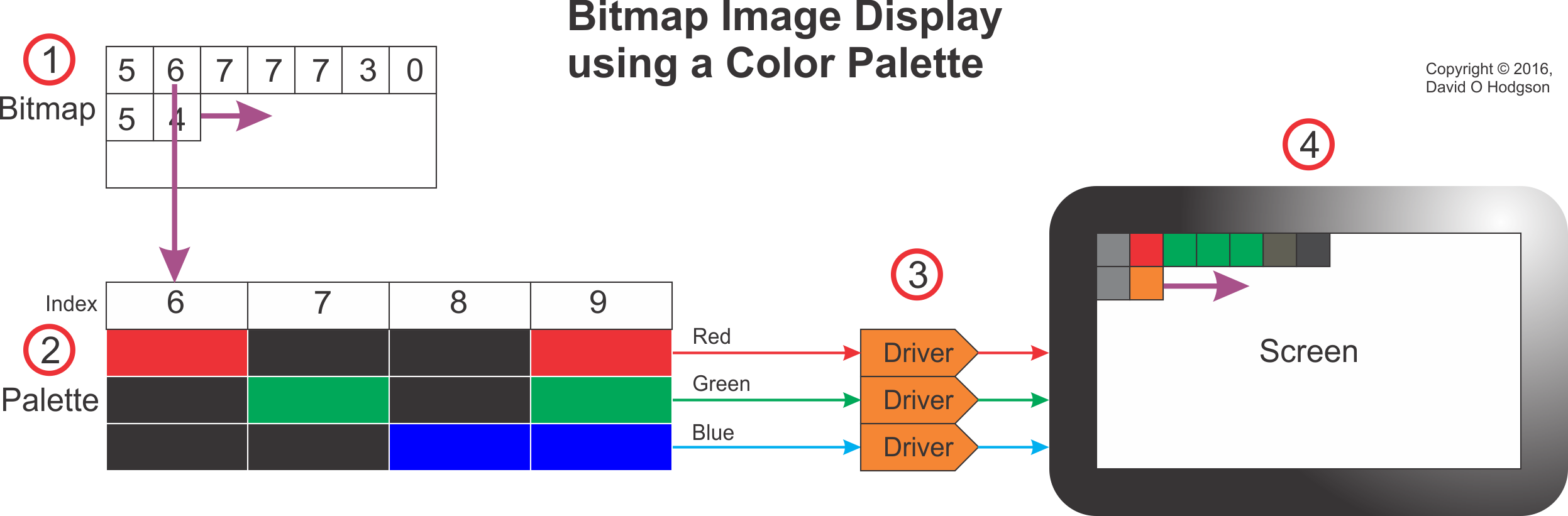
The image below shows how a palettized bitmap image is displayed on a screen. The screen could be any digital bitmap display, such as a computer, tablet or smartphone.
Palette-based Display System
The system works as follows (the step numbers below correspond to the callout numbers in the image):
As the bitmap image in memory is scanned sequentially, each index value in the bitmap is used to “look up” a corresponding entry in the palette.
Each index value acts as a lookup to an RGB triple value in the palette. The correct RGB triple value for each pixel is presented to the Display Drivers.
The Display Drivers (which may be Digital-to-Analog Converters, or some other circuity, depending on the screen technology) create red, green and blue signals to illuminate the pixels of the device screen.
The device screen displays the full-color image reconstituted from the index bitmap and the palette.
Hardware Palette
In the early days of computer graphics, memory was expensive and capacities were small. It made economic sense to maximize the use of digital color palettes where possible, to minimize the amount and size of memory required. This was particularly important in the design of graphics display cards, which required sufficient memory to store at least one full frame of the display. By adding a small special area of memory on the card for use as a palette, it was possible to reduce the size of the main frame memory substantially. This was achieved at the expense of complexity, because now every image that was displayed had to have a palette. To avoid having to create a special palette for every image, Standard color palettes and then Adaptive color palettes were developed; for more details, see Standard vs. Adaptive Palettes below.
One of the most famous graphics card types that (usually) relied on hardware color palettes was the IBM VGA (Virtual or Video Graphics Array) for PCs (see https://en.wikipedia.org/wiki/Video_Graphics_Array).
As the cost of memory has fallen, and as memory device capacities have increased, the use of hardware palettes has become unnecessary. Few, if any, modern graphics cards implement hardware palettes. However, there are still some good reasons to use software palettes.
Software Palette
Generally, the software palette associated with an image is included in the image file itself. The palette and the image matrix form separate sections within one file. Some image formats, such as GIF, require the use of a software palette, whereas others, such as BMP, don’t support palettes at all.
Modern bitmap image formats, such as PNG, usually offer the option to use a palette, but do not require it.
Standard & Adaptive Palettes
Back when most graphics cards implemented hardware palettes, rendering a photograph realistically on screen was a significant problem. For example, a photograph showing a cloud-filled sky would include a large number of pixels whose values are various shades of blue, and the color transitions across the image would be smooth. If you were to try to use a limited color palette to encode the pixel values in the image, it’s unlikely that the palette would include every blue shade that you’d need. In that case, you were faced with the choice of using a Standard Palette plus a technique called Dithering, or else using an Adaptive Palette, as described below.
Standard Palette
Given that early graphics cards could display only palettized images, it simplified matters to use a Standard palette, consisting of only the most commonly-used colors. If you were designing a digital image, you could arrange to use only colors in the standard palette, so that it would be rendered correctly on-screen. However, the standard palette could not, in general, render a photograph realistically—the only way to approximate that was to apply Dithering.
The most commonly-used Standard palette for the VGA graphics card was that provided by BIOS Mode 13H.
Dithering
One technique that was often applied in connection with palettized bitmap images is dithering. The origin of the term “dithering” seems to go back to World War II. When applied to palettized bitmap images, the dithering process essentially introduces “noise” in the vicinity of color transitions, in order to disguise abrupt color changes. Dithering creates patterns of interpolated color values, using only colors available in the palette, that, to the human eye, appear to merge and create continuous color shades. For a detailed description of this technique, see https://en.wikipedia.org/wiki/Dither.
While dithering can improve the appearance of a palettized image (provided that you don’t look too closely), it achieves its results at the expense of reduced image resolution, because of the fact that the dithering of pixel values introduces “noise” into the image. Therefore, you should never dither an image that you want to keep as a “master”.
Adaptive Palette
Instead of specifying a Standard Palette that includes entries for any image, you can instead specify a palette that is restricted only to colors that are most appropriate for the image that you want to palettize. Such palettes are called Adaptive Palettes. Most modern graphics software can create an Adaptive Palette for any image automatically, so this is no longer a difficult proposition.
A significant problem with Adaptive Palettes is that a display device that relies on a hardware palette can typically use only one palette at a time. This makes it difficult or impossible to display more than one full-color image on the screen. You can set the device’s palette to be correct for the first photograph and the image will look great. However, as soon as you change the palette to that for the second photograph, the colors in the first image are likely to become completely garbled.
Fortunately, the days when graphical display devices used hardware palettes are over, so you can use Adaptive Palettes where appropriate, without having to worry about rendering conflicts.
Should you Use Digital Color Palettes?
Palettization of an image is usually a lossy process. As I explained in a previous post [How to Avoid Mosquitoes], you should never apply lossy processes to “master” files. Thus, if your master image is full-color (e.g., a photograph), you should always store it in a “raw” state, without a palette.
However, if you want to transmit an image as efficiently as possible, it may reduce the file size if you palettize the image. This also avoids the necessity to share the high-quality unpalettized master image, which could be useful if you’re posting the image to a public web page.
If it’s obvious that your image uses only a limited color range, such as a monochrome photograph, then you can palettize it without any loss of color resolution. In the case of monochrome images, you don’t usually have to create a custom palette, because most graphics programs allow you to store the image “as 8-bit Grayscale”, which achieves the same result.
In summary, then, in general it’s best not to use palettes for full-color images. However, if you know that your image is intended to contain only a limited color range, then you may be able to save file space by using a palette. Experimentation is sometimes necessary in such cases. You may also want to palettize an image so that you don’t have to make the high-quality original available publicly. If you’re an artist who has created an image that deliberately uses a limited palette of colors, and you want to store or communicate those choices, then that would also be a good reason to use a palettized image.
I snapped the image above many years ago during a visit to the Midlands Air Museum, near Coventry (England). It depicts the one-and-only Boulton-Paul P.111A research aircraft, which, due to its dangerous flight characteristics, was nicknamed the “Yellow Peril”.
I’ve posted this image now not to discuss the aerodynamics of the P.111A, but to consider its color. If you’re looking at the image on a computer monitor (including the screen of your phone, tablet or any similar digital device), you’re presumably seeing the plane’s color as bright yellow.
No Yellow Light Here
That, however, is an illusion, because no yellow light is entering your eyes from this image. What you are actually seeing is a mixture of red and green light, which, thanks to the limitations of the human visual system, fools your brain into thinking that you’re seeing yellow.
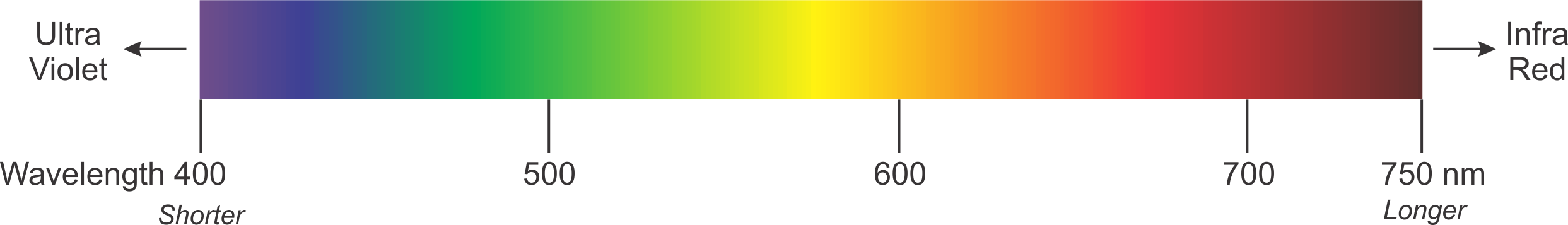
The Visible Spectrum
Most of us learn in school that what we see as visible light consists of a limited range of electromagnetic waves, having specific frequencies. Within the frequency range of visible light, most humans can distinguish a continuous spectrum of colors, as shown below.
(The wavelength range is in nanometers; nm)
We’re also taught that “white” light does not exist per se, but is instead a mixture of all the colors of light in the visible spectrum.
That’s a significant limitation of the human visual system; we can only see light whose frequency falls within a limited range. There are vast ranges of “colors” of light that aren’t visible to us. Presumably, our visual systems evolved to respond to the frequencies of light that were most useful to our ancestors in their own environment.
How do we see Color?
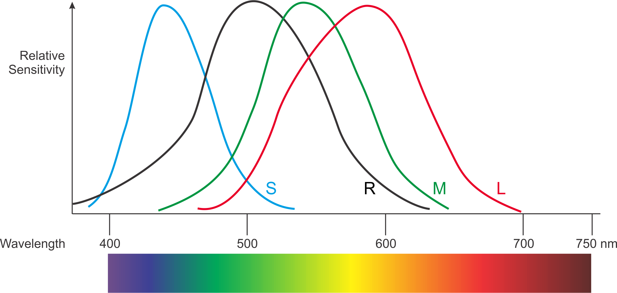
That leads to the question of how we can determine which light frequencies we’re seeing. Do our eyes contain some kind of detector cell that can measure the frequency of a ray of light? In fact, the system that evolution has bequeathed to us is a little more complex. Our eyes contain several different types of detector cell, each of which responds most strongly to light within a narrow frequency range.
There is one cell type called “rods” (because of their shape) that detect a relatively broad spectrum of light, but which are most sensitive to blue-green light. When the ambient light is low, the rods do most of the work for us, giving us monochrome vision.
There are also three types of cell called “cones”, the detection ranges of which overlap that of the rods. One type of cone is most sensitive to blue light, the second to green light, and the third to red. Given that blue light has the shortest visible wavelength, and red light the longest, the three types of cones are respectively called L (Long = Red), M (Medium = Green), and S (Short = Blue).
The diagram below shows the relative sensitivity of the rods (R) and cones (S, M, L) with respect to wavelength. I’ve also superimposed the color rainbow for convenience.
It’s thanks to the existence of the cone cells that we have color vision. The brain actually combines the information from all the detector cells, and determines from that which color we’re actually looking at.
Fooling the Brain
The nature of our visual system makes it possible to fool our brains into thinking that we’re seeing colors that are not actually present, by combining red, green and blue light in varying intensities.
Technology takes advantage of this limitation to provide what seem to be full-color images (or videos) that use only three color channels: one each for red, green and blue (hence the RGB acronym). Such color systems are known as “Additive Color”.
Conversely, printed color images are created using a three-color (or four-color, if black is added) system that is “Subtractive”. Subtractive systems use Cyan, Magenta, Yellow and optionally Black as their “primary” colors, leading to acronym CMYK. A continuous spectrum of color is achieved by overlaying translucent layers of CMYK in varying proportions. Subtractive color systems are a complex topic in themselves, so I don’t plan to go into further detail about them in this article.
Here’s a comparison of the features of additive versus subtractive color.
Additive Color
In an additive color system, you add colored lights together to create the illusion of a continuous spectrum.
The human brain creates the illusion of a continuous spectrum of colors.
It’s important to realize that, in an additive system, the colors do not somehow combine in space to create a color that’s not there. Instead, our brains combine the responses of the three types of cone in our eyes.
Subtractive Color
In a subtractive color system, you start with white light (or paper), then subtract particular colors from white.
In a printed image, overlaid color dyes block some light wavelengths, so the remaining wavelengths that pass through create the final color.
This is not an “optical illusion” in the same way as additive color. With subtractive color, the yellow light you see really is yellow.
Viewing a Color Image
Television and computer screens use additive color. The screen you’re viewing is comprised of a large matrix of red, green and blue dots. By varying the intensity of light from each of the dots across the screen, your brain is tricked into thinking that it’s seeing a continuous spectrum of color from blue to red. The size of each dot is so small that your brain merges the light from neighboring dots together.
Are You Looking at a Print, a Slide or a Screen?
So, if you’re reading this article on a computer screen, the image of the Boulton Paul P.111A that you can see isn’t actually shining any yellow light into your eyes, but is using red and green light to fool your brain into thinking that you’re seeing yellow.
Having said all that, my image of the P.111A was originally a Kodachrome 25 color slide. Kodachrome slides create colors using a subtractive process, overlaying translucent layers of secondary colors. Thus, if you could view the original slide, you would indeed see yellow light, created by subtracting blue light from a white source shining through the slide.
If this all seems very complex at first, don’t be deterred, because I know from personal experience that it’s easy to become confused even when you’ve been working with these principles for a long time. When designing digital video equipment years ago, I sometimes found myself forgetting that, in nature, yellow light really is yellow, and is not a mixture of red and green light!
I received some feedback from my previous posts on computer graphics asking for a basic explanation of the differences between the two main ways of representing images in digital computer files, which are:
Bitmap “paintings”
Vector “drawings”
Most people probably view images on their computers (or phones, tablets or any other digital device with a pictorial interface) without giving any thought to how the image is stored and displayed in the computer. That’s fine if you’re just a user of images, but for those of us who want to create or manipulate computer graphic images, it’s important to understand the internal format of the files.
Bitmap Images
If you’ve ever taken or downloaded a digital photo, you’re already familiar with bitmap images, even if you weren’t aware that that’s what digital photos are.
A bitmap represents an image by treating the image area as a rectangle, and dividing up the rectangle into a two-dimensional array of tiny pixels. For example, an image produced by a high-resolution phone camera may have dimensions of 4128 pixels horizontally and 3096 pixels vertically, requiring 4128×3096 = 12,780,288 pixels for the entire image. (Bitmap images usually involve large numbers of pixels, but computers are really good at handling large numbers of items!) Each pixel specifies a single color value for the image at that point. The resulting image is displayed simply by copying (“blitting”) the array of pixels to the screen, with each pixel showing its defined color.
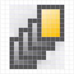
Some of the smallest bitmap images you’ll see are the icons used for programs and other items in computer user interfaces. The size of these bitmaps can be as small as 16×16 pixels, which provides very little detail, but is sufficient for images that will always be viewed in tiny sizes. Here’s one that I created for a user interface some time ago:
Enlarging this image enables you to see each individual pixel:
You can see the pixel boundaries here, and count them to confirm that (including the white pixels at the edges) the image is indeed 16×16 pixels.
Obviously, the enlarged image looks unacceptably crude, but, since the image would normally never be viewed at this level of magnification, it’s good enough for use as an icon. In most cases, such as digital photographs, there are so many pixels in the bitmap that your eye can’t distinguish them at normal viewing sizes, so you see the image as a continuous set of tones.
Bitmap images have a “resolution”, which limits the size to which you can magnify the image without visible degradation. Images with higher numbers of pixels have higher resolution.
Given that bitmap image files are usually large, it’s helpful to be able to be able to compress the pixel map in some way, and there are many well-known methods for doing this. The tradeoff is that, the more compression you apply, the worse the image tends to look. One of the best-known is JPEG (a standard created by the Joint Photographic Experts’ Group), which is intended to allow you to apply variable amounts of compression to digital photographs. However, it’s important to realize that bitmap image files are not necessarily compressed.
Programs that are designed to process bitmap images are referred to as “paint” programs. Well-known examples are: Adobe Photoshop and Corel PhotoPaint.
Vector Images
The alternative way of producing a computer image is to create a list of instructions describing how to draw the image, then store that list as the image file. When the file is opened, the computer interprets each instruction and redraws the complete image, usually as a bitmap for display purposes. This process is called rasterization.
This may seem to be an unnecessarily complex way to create a computer image. Wouldn’t it just be simpler to stick to bitmap images for everything? Well, it probably wouldn’t be a good idea to try to store a photo of your dog as a vector image, but it turns out that there are some cases where vector images are preferable to bitmap images. Part of the skill set of a digital artist is knowing which cases are best suited to vector images, and which to bitmaps.
There are many vector drawing standards, and many of those are proprietary (e.g., AI, CDR). One open vector drawing standard that’s becoming increasingly popular is SVG (Scalable Vector Graphics). You can view the contents of an SVG file by opening it with a text editor program (such as Notepad).
Here’s a very simple example of an SVG image file, consisting of a white cross on a red circle:
(Not all browsers can interpret SVG files, so I rendered the image above as a bitmap to ensure that you can see it!)
If you open the SVG file with a text editor, you can see the instructions that create the image shown above. In this case, the important instructions look like this:
As you’d expect, the instructions tell the computer to draw a “circle”, and then create the cross item by following the coordinates specified for the “path” item.
Of course, if you were to try to represent a photograph of your dog as a vector image, the resulting file would contain a huge number of instructions. That’s why bitmap images are usually preferable for digital photographs and other very complex scenes.
A major advantage of vector image formats is that the picture can be rendered at any size without degradation. Bitmap images have inherent resolutions, which vector images do not have.
Programs that are designed to process vector images are referred to as “drawing” programs. Well-known examples are: Adobe Illustrator and Corel Draw.
Converting Between Bitmap and Vector Images
It’s often necessary to convert a vector image into a bitmap image, and, less frequently, to convert a bitmap image into a vector image.
Conversion of vector images to bitmaps occurs all the time, every time you want to view the content of a vector image. When you open a vector image, the computer reads the instructions in the file, and draws the shapes into a temporary bitmap that it displays for you.
Converting bitmaps to vector images requires special software. The process is usually called “Tracing”. Years ago, you had to buy tracing software separately, but now most vector drawing software includes built-in tracing capabilities. As the name suggests, tracing software works by “drawing around” the edges of the bitmap, so that it creates shapes and lines representing the image. The result of the operation is that the software generates a set of mathematical curves that define the vector image.
Summary of the Pros and Cons
There are situations where bitmap images are preferable to vector images, and vice versa. Here’s a summary of the pros and cons of each type.
Bitmap
Advantages:
Complex scenes can be depicted as easily as simple scenes.
Significant compression is usually possible, at the expense of loss of quality.
Rendering is computationally easy; requires minimal computing power.
Disadvantages:
Size: Files tend to be large.
Not scalable: attempting to magnify an image causes degradation.
Vector
Advantages:
Compact: Files tend to be small.
Scalable: images can be displayed at any resolution without degradation.
Disadvantages:
Complex scenes are difficult to encode, which tends to create very large files.
Rendering is computationally intensive; requires significant computing power.